1 min read


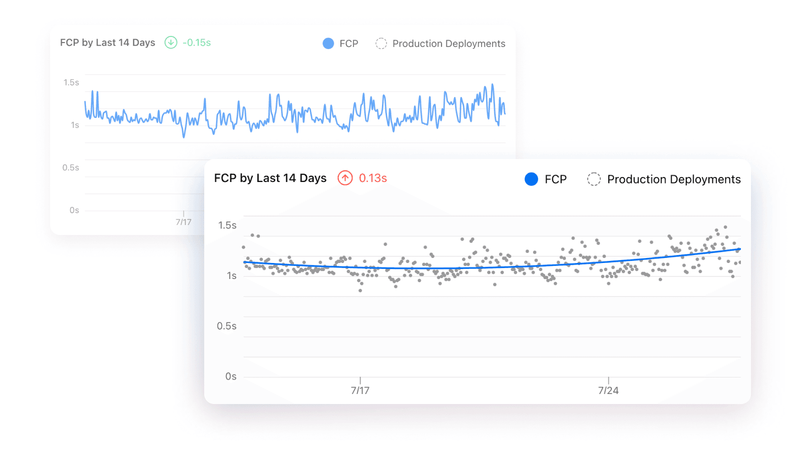
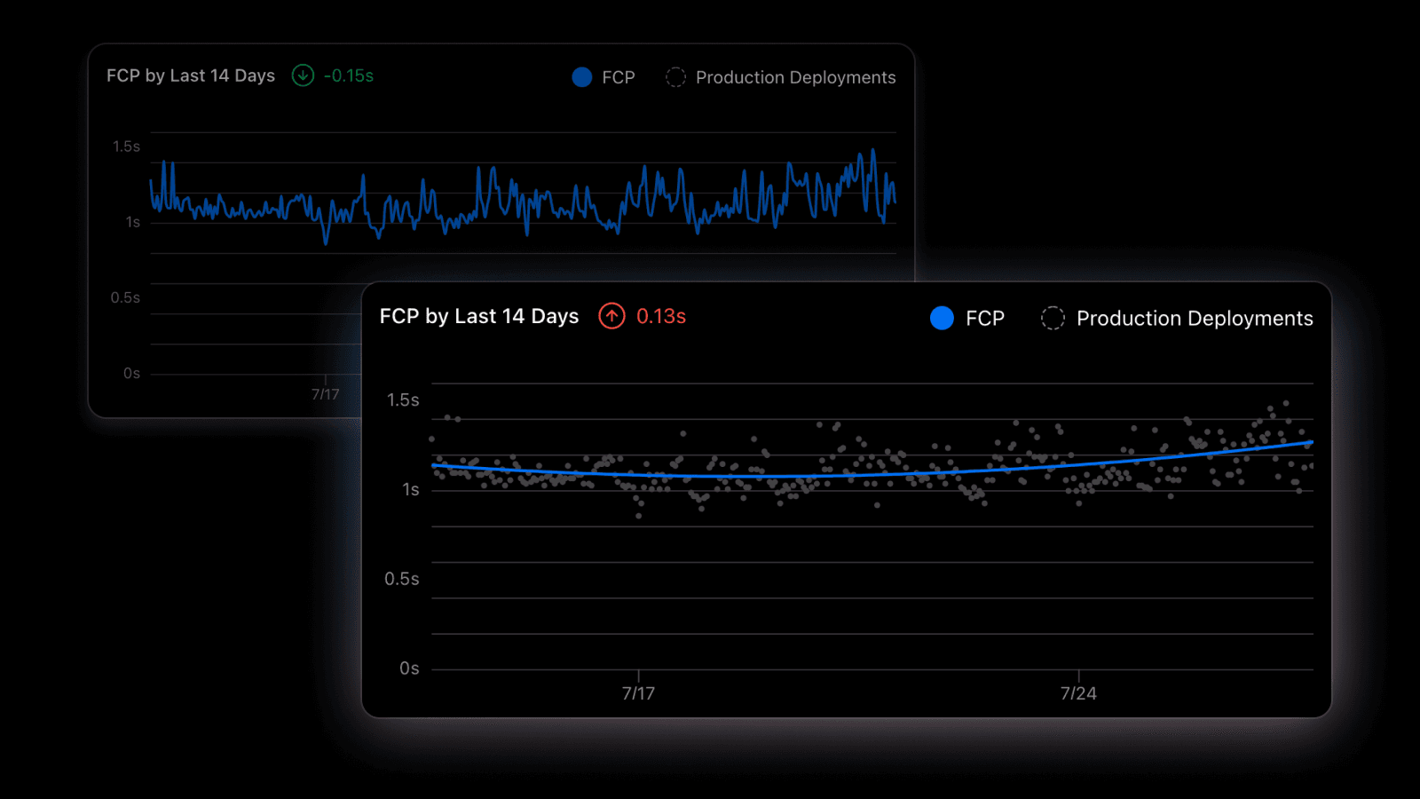
It's now easier to visualize performance trends over time with Vercel Analytics.
Individual Core Web Vital data points are now displayed as a scatter plot with a trend line showing the estimation curve. This line is shown when there are more than 100 data points for the currently selected date and time window. The performance delta is calculated based on the estimation curve instead of the first and last data points for improved accuracy.
Check out the documentation to learn more.