6 min read
How to use the Next.js Image component to automatically optimize hundreds of image.
We held our biggest ever Next.js Conference on October 25, 2022 with over 110,000 registered developers, 55,000 online attendees, and hundreds attending in person in San Fransisco. We had photographers on site to capture the experience and we wanted to share the photos they took with the community.
Instead of just sharing photos with a Google Drive link, we thought it’d be good idea to showcase these 350+ amazing photos in an image gallery that was fast, functional, and beautiful. We ended up building our own and open sourcing the code, making it easy for anyone to build their own image gallery.
In this blog post, we’re going to share the techniques we used to build a performant image gallery site that can handle hundreds of large images and deliver a great user experience.
Link to headingRendering hundreds of images performantly
The biggest challenge was handling hundreds of high quality images with large source file sizes. We used Cloudinary as our CDN to store all of these images, fetched them all at build time using getStaticProps, and then used the Next.js Image component to display them. We made several decisions along the way to make the site as fast as possible. Let’s explore the choices we made.
There are three different areas in the application that displayed images:
The main screen, where images were displayed in a large grid.
The modal that pops up when a user clicks an image, which displayed both a large version and a bottom carousel showing the rest of the images as thumbnails.
The individual dynamic routes that displayed a single standalone photo in high resolution.
To ensure great performance throughout the application, we fetched the same images at different sizes for each of these areas.
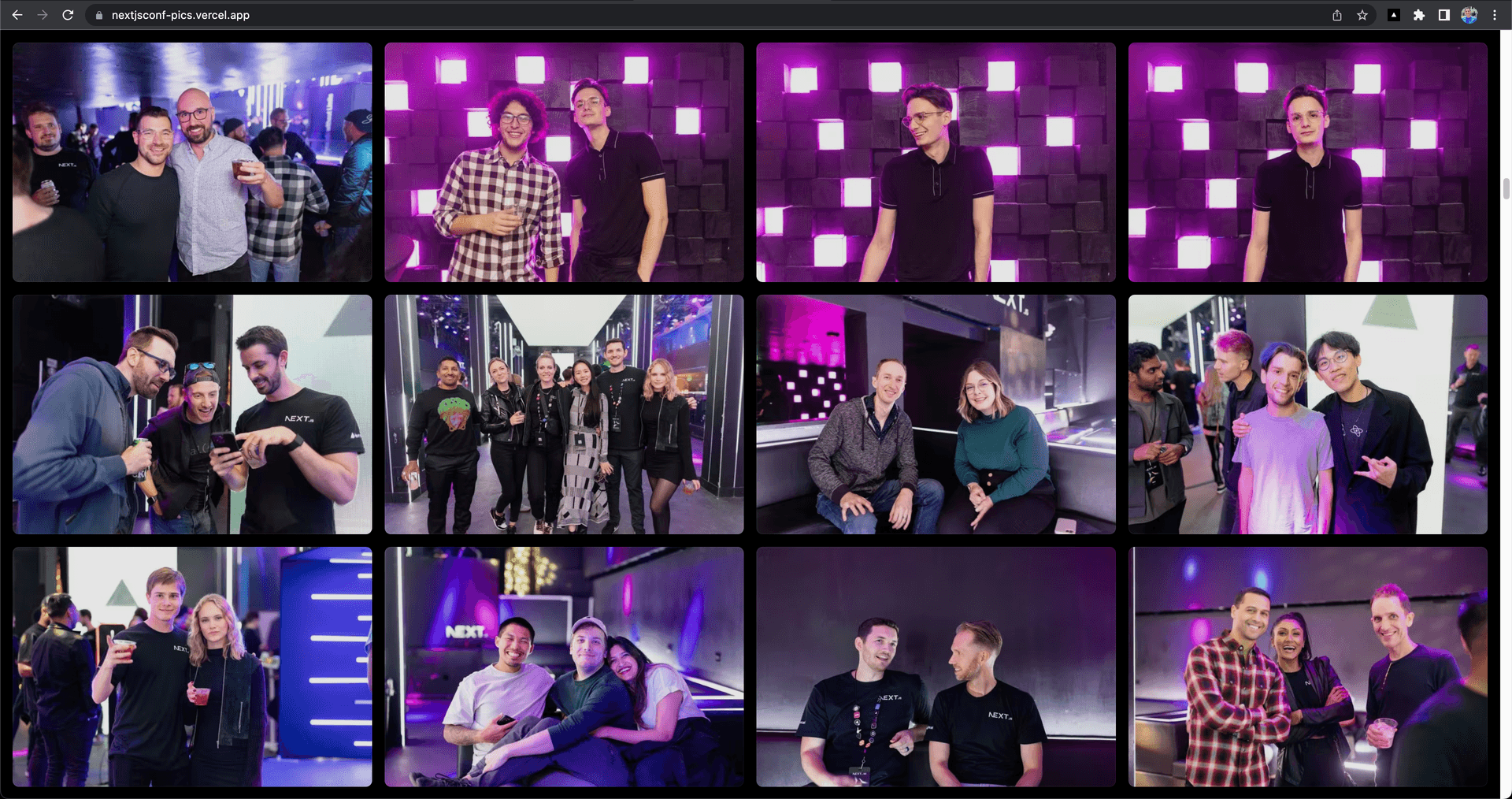
In the main screen below, we fetched the images at 720x480px. This was trivial to do with Cloudinary’s Transformation URL API – simply adding a w=720 query parameter did the trick.

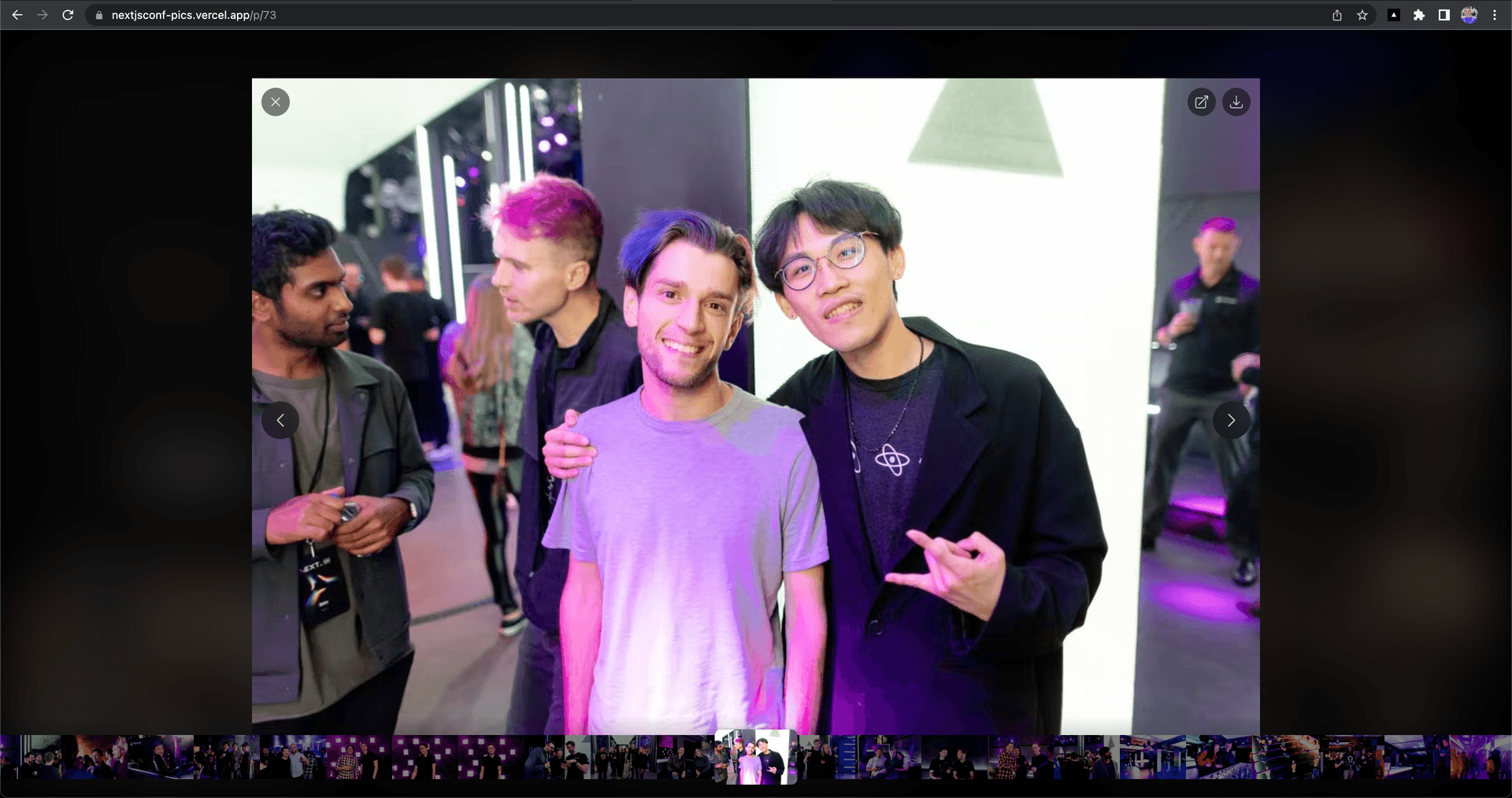
When you enter the modal, you can see that there’s a main image, then a carousel at the bottom with several smaller images. We fetched the main image at 1280x853px and used the priority prop in next/image so it would be preloaded to improve loading performance. We then fetched the smaller images at 180x120px.

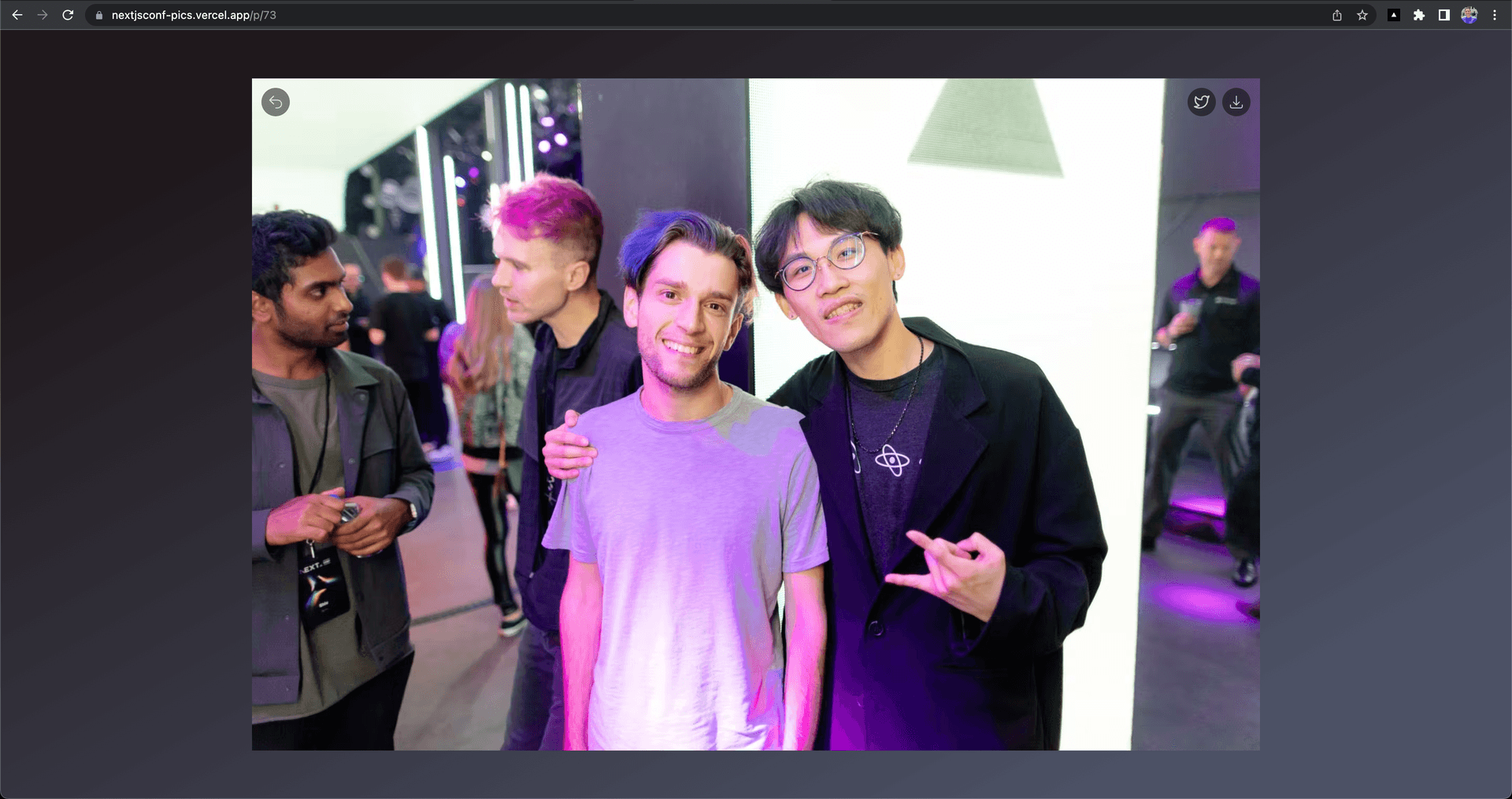
You may notice something interesting here. The URL of the website is the same between the last screenshot and the next screenshot below, yet the page is different. How is this possible?
We achieved this thanks to the Link component’s as prop, which can mask the URL. When changing photos, we wanted the navigation to be fast and animated, which required staying on a single page–the index page in our case. To achieve this, we used a query parameter called photoId to identify the currently selected photo and stay on the index page. We also added the shallow prop to ensure we didn’t re-fetch data when the query param changed.
const Home: NextPage = () => { const [loading, setLoading] = useState<boolean>(false); const [bio, setBio] = useState<String>(""); const [vibe, setVibe] = useState<VibeType>("Professional"); const [generatedBios, setGeneratedBios] = useState<String>("");
const prompt = `Generate 2 ${vibe} twitter bios with no hashtags and clearly labeled "1." and "2.". Make sure each generated bio is at least 14 words and at max 20 words and base them on this context: ${bio}`;
const generateBio = async (e: any) => { // call serverless function };
return ( <Layout> <Header /> <main className="flex flex-1 w-full flex-col items-center justify-center text-center px-4 mt-12 sm:mt-20"> <a className="flex max-w-fit items-center justify-center space-x-2 rounded-full border border-gray-300 bg-white px-4 py-2 text-sm text-gray-600 shadow-md transition-colors hover:bg-gray-100 mb-5" href="https://github.com/Nutlope/twitterbio" target="_blank" rel="noopener noreferrer" > <Github /> <p>Star on GitHub</p> </a> <h1 className="sm:text-6xl text-4xl max-w-2xl font-bold text-slate-900"> Generate your next Twitter bio in seconds </h1> <p className="text-slate-500 mt-5">18,167 bios generated so far.</p> <div className="max-w-xl"> <div className="flex mt-10 items-center space-x-3"> <Image src="/1-black.png" width={30} height={30} alt="1 icon" className="mb-5 sm:mb-0" /> <p className="text-left font-medium"> Copy your current bio{" "} <span className="text-slate-500"> (or write a few sentences about yourself). </span> </p> </div> <textarea value={bio} onChange={(e) => setBio(e.target.value)} rows={4} className="w-full rounded-md border-gray-300 shadow-sm focus:border-black focus:ring-black my-5" placeholder={ "e.g. Senior Developer Advocate @vercel. Tweeting about web development, AI, and React / Next.js. Writing nutlope.substack.com." } /> <div className="flex mb-5 items-center space-x-3"> <Image src="/2-black.png" width={30} height={30} alt="1 icon" /> <p className="text-left font-medium">Select your vibe.</p> </div> <div className="block"> <DropDown vibe={vibe} setVibe={(newVibe) => setVibe(newVibe)} /> </div>
{!loading && ( <button className="bg-black rounded-xl text-white font-medium px-4 py-2 sm:mt-10 mt-8 hover:bg-black/80 w-full" onClick={(e) => generateBio(e)} > Generate your bio → </button> )} {loading && ( <button className="bg-black rounded-xl text-white font-medium px-4 py-2 sm:mt-10 mt-8 hover:bg-black/80 w-full" disabled > <LoadingDots color="white" style="large" /> </button> )} </div> <hr className="h-px bg-gray-700 border-1 dark:bg-gray-700" /> <div className="space-y-10 my-10"> {generatedBios && ( <> <div> <h2 className="sm:text-4xl text-3xl font-bold text-slate-900 mx-auto"> Your generated bios </h2> </div> <div className="space-y-8 flex flex-col items-center justify-center max-w-xl mx-auto"> {generatedBios .substring(generatedBios.indexOf("1") + 3) .split("2.") .map((generatedBio) => { return ( <div className="bg-white rounded-xl shadow-md p-4 hover:bg-gray-100 transition cursor-copy border" key={generatedBio} > <p>{generatedBio}</p> </div> ); })} </div> </> )} <Footer /> </Layout> </div> );};
export default Home;When the page is refreshed, it stops using the photoId query param and instead uses the /p/[id] dynamic route that has a slightly different layout as seen below.

In this dynamic route, because we pre-generate it, we actually request a higher resolution photo (2560x1706px) and set the OG card to use the image for that specific dynamic route. It’s inspired by how Facebook Messenger shows images with their background blurred. Finally, we added a Share on Twitter button that autofills the Tweet with a picture that comes from the OG image for the specific page being shared.
However, we wanted to also make it so folks could access the original high resolution images, which were all in 4k resolution. We did this by including a link to the high quality image at the top right of the modal in a download button.
Link to headingGenerating image placeholders for optimal UX
We used image blur placeholders to instantly show users something as the images were loading. We did this by taking our images, blurring them by fetching them at a very small size, then converting them to base64. Base64 is a way to represent images in a long string format. The benefit of doing this is that you can embed these placeholders directly in your HTML, without needing to make a request. This makes them load instantly, no matter how slow the client device’s internet is.
To make sure page weight was minimal, we also performed an optimization to minify the image before generating the blurred versions using a library called imagemin.
This is the function we used to generate our image placeholders.
import imagemin from "imagemin";import imageminJpegtran from "imagemin-jpegtran";
export async function getBase64ImageUrl(imageUrl: string) { // fetch image and convert it to base64 const response = await fetch(imageUrl); const buffer = await response.arrayBuffer(); const minified = await imagemin.buffer(Buffer.from(buffer), { plugins: [imageminJpegtran()], }); const base64 = Buffer.from(minified).toString("base64") return `data:image/jpeg;base64,${base64}`;}Link to headingUsing the Next.js Image component
Another big performance win was using the Next.js Image component. Let’s take a look at all the properties we used.
<Image alt={caption} style={{ transform: "translate3d(0, 0, 0)" }} className="transform rounded-lg brightness-90 transition group-hover:brightness-110" placeholder="blur" blurDataURL={blurDataUrl} src={`https://res.cloudinary.com/...`} width={720} height={480} loading={id < 4 ? "eager" : "lazy"} sizes="(max-width: 640px) 100vw, (max-width: 1280px) 50vw, (max-width: 1536px) 33vw, 25vw"/>Auto-generated alt text: We used a caption for the alt text. We’ll talk about how we generated this in the auto-generated alt tag section.
Translate3d CSS property: Translate3d is typically used to move an element in 3d space, but when it's used with (0,0,0), it doesn't move the element at all. Instead, it makes some devices use their GPU for rendering–something that traditionally, only native apps could do. Since most rendering in browsers is usually done with software, using a GPU results in higher frames per second and smoother rendering when scrolling through hundreds of images, especially on Safari.
Blur placeholder: The blur placeholder that we talked about in the last section was also used.
Lazy Loading: We defined an explicit width and height, and set the
loadingprop to eager for the first 4 images to get those loaded as soon as possible, then lazy loaded the rest so that only the images in the user’s viewport loaded initially. The images would progressively load as the user scrolled.Sizes property: We set the
sizesproperty to let Next.js know the exact space the images would take up on different viewports in advance to only generate the correct sizes.
It was important that not all the images on the page loaded at once since this would significantly slow down the First Input Delay (FID) and increase page loading time in general. Thankfully, next/image does this lazy loading by default, only loading images that are in the user's viewport.
Link to headingImplementing smooth animations
For our animations, we used Framer Motion, a declarative animation library for React. This let us pull off several animations, including the animations when navigating through images in the modal and animating the modal itself when the user clicked a photo. In addition to these animations, we used loading states, taking advantage of the onLoadingComplete prop in next/image, to only load the buttons on the modal after the image finished loading.
To learn more about the techniques we used to animate our image gallery, watch Animating an Image Carousel. We also used a library called react-swipable to implement swiping through the modal on mobile devices, making it behave more like photo galleries on native apps.
Link to headingAccessibility wins with Headless UI and auto-generated alt tags
To improve the accessibility of the site, we used a UI library called Headless UI, which provides many built-in fully accessible components. We also used AI to programmatically generate alt tags for all our 300+ photos.
Note that using AI to generate image tags is not perfect and we manually reviewed all the generated alt tags to make sure they were correct. Here's the script we used to generate the alt tags. It reads images from our CDN (Cloudinary), passes them into the API, then saves the generated description as metadata back to Cloudinary.
import cloudinary from "../../utils/cloudinary";
export default async function getAltText() { const results = await cloudinary.v2.search .expression(`folder:${process.env.CLOUDINARY_FOLDER}/*`) .sort_by("public_id", "desc") .max_results(400) .execute(); for (let result of results.resources) { const imageUrl = result.url; const response = await fetch( `https://alt-text-generator.vercel.app/generate?imageUrl=${imageUrl}` ); const altText = await response.text(); const finalAltText = altText.split("Caption: ")[1]; await cloudinary.v2.api.update( result.public_id, { type: "upload", context: { caption: finalAltText } }, function (_, result) { console.log({ result }); console.log(`${result.public_id} done`); } ); }}Link to headingRestoring scroll when navigating back to the grid
Another helpful feature we implemented is keeping track of what the current photo in the modal is, so when users pressed outside the modal or hit escape, they would go back to the grid of photos scrolled to the exact position that photo was in. This made for a great user experience, especially when folks shared dynamic photos that were further down the page.
We did this by keeping track of the last known photo in the modal, then using the browser scrollIntoView method to scroll to that specific ref when the user exited the modal.
import Image from "next/image";import Link from "next/link";import { useEffect, useRef } from "react";import { useLastViewedPhoto } from "../utils/useLastViewedPhoto";
export default function GridImage() { const router = useRouter(); const { photoId } = router.query;
const [lastViewedPhoto, setLastViewedPhoto] = useLastViewedPhoto(); const lastViewedPhotoRef = useRef<HTMLAnchorElement>(null);
useEffect(() => { // This effect keeps track of the last viewed photo in the modal if (lastViewedPhoto && !photoId) { lastViewedPhotoRef.current.scrollIntoView({ block: "center" }); setLastViewedPhoto(null); } }, [photoId, lastViewedPhoto, setLastViewedPhoto]);
return ( <Link key={id} href={`/?photoId=${id}`} as={`/p/${id}`} ref={id === lastViewedPhoto ? lastViewedPhotoRef : null} shallow className="..." > <Image src="..." width={720} height={480} /> </Link> );}Link to headingFinal performance
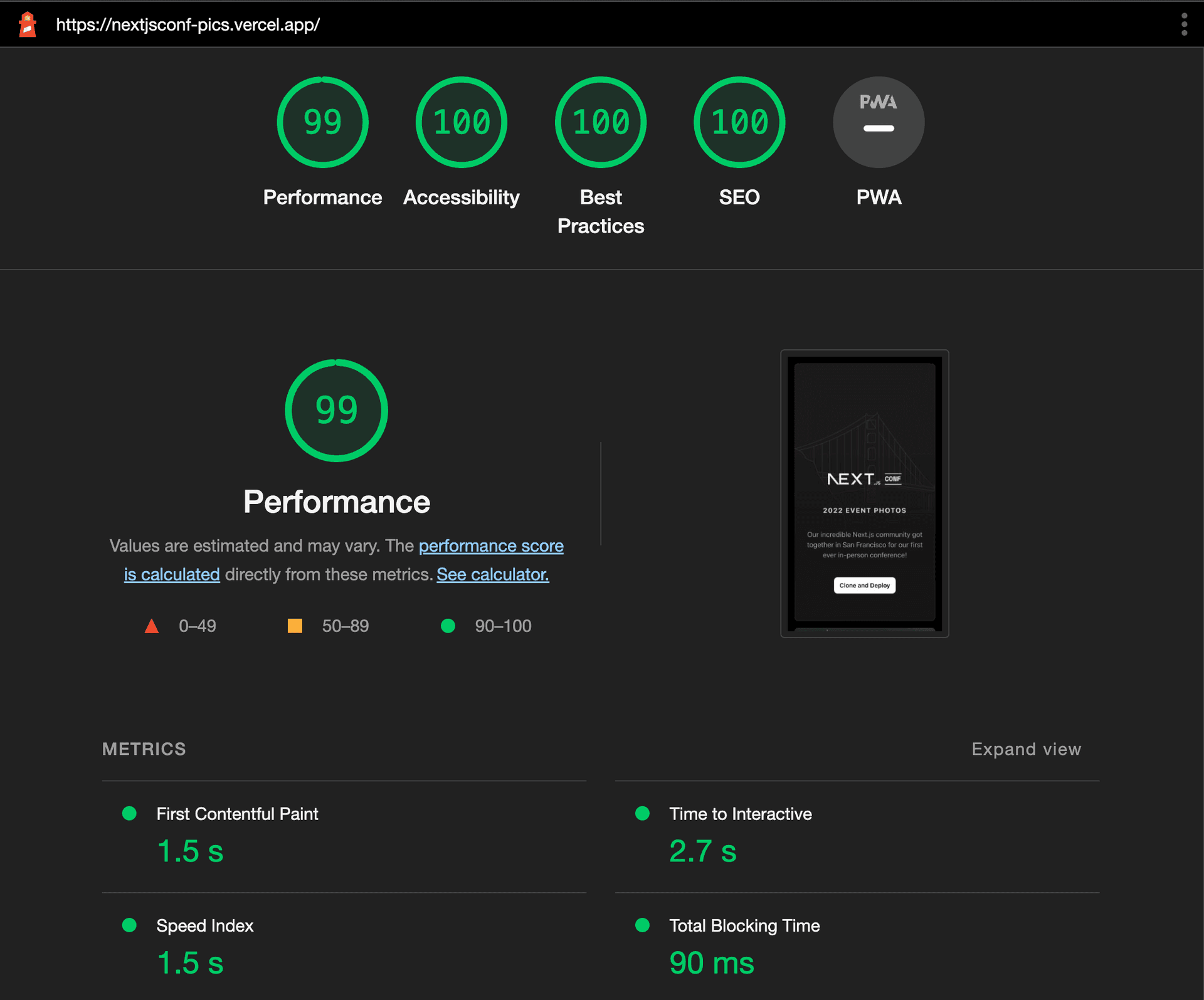
All the decisions we made led to a website that not only has a nearly perfect Lighthouse score and great core web vitals, but feels snappy to use while handling hundreds of images.

Link to headingClone and deploy today
We hope this walkthrough helps outline some of the challenges we faced and our thought process for handling them. You can visit the Next.js Conf Image Gallery site to see everything we talked about in action or clone and deploy your own today.
Want to get started with Next.js on Vercel? Here's a trial to get you deploying on the only infrastructure that will always support the latest Next.js features the moment they release.