4 min read
Learn how to optimize web fonts using resource hints, font-face descriptors, and the next/font module.
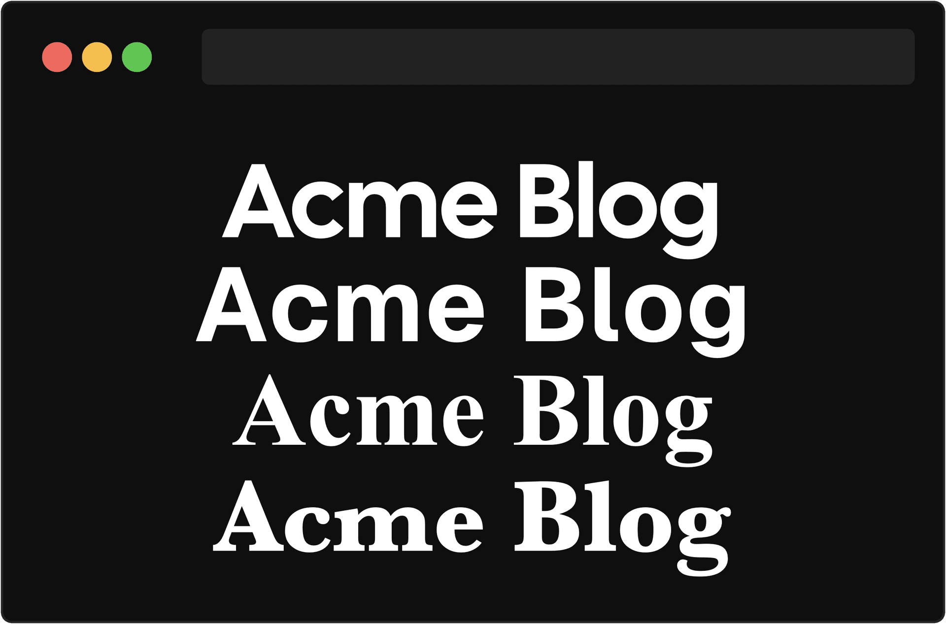
Web fonts are vital to branding and user experience. However, the inconsistent rendering of these fonts while they're being fetched from the server can cause unintended shifts in layout.
Luckily, there are solutions to minimize unexpected shifts and enhance the user experience when working with web fonts.
Ever noticed a split-second change in the font while a page loads? Or even no text at all for a short moment?

These flashes of invisible and unstyled text happen because the browser is still fetching the web font from the server that hosts the fonts.
Luckily, the font-display property gives developers control over this behavior by setting it to either block, swap, fallback, optional, or auto.
block can be used to prioritize visual consistency by keeping text invisible for a couple seconds. If the custom font hasn't loaded within that time, it shows a fallback until the custom font is available.

You can use swap to make the content visible immediately by rendering a fallback font first, which is then switched to the custom font once loaded.

fallback provides a balance between block and swap. It briefly renders invisible text, and defaults to the fallback font. If the web font still hasn’t loaded after 3 seconds, the fallback font remains even if the custom font loads later. Future navigations will display the custom font.

optional lets the browser to decide whether to use the web font based on factors like network speed. If the font is cached and loads within 100ms, the custom font is displayed. Otherwise, the fallback font remains.

auto lets the browser decide which strategy to use, typically defaulting to swap.
Link to headingEnsuring Consistency with Fallback Fonts
If you choose to display a fallback font, it is important to ensure that this fallback font closely matches the intended web font. However, this can be tricky because fonts have different measurements. Even if the fallback font and the web font have the same font-size, layout shift can still occur.

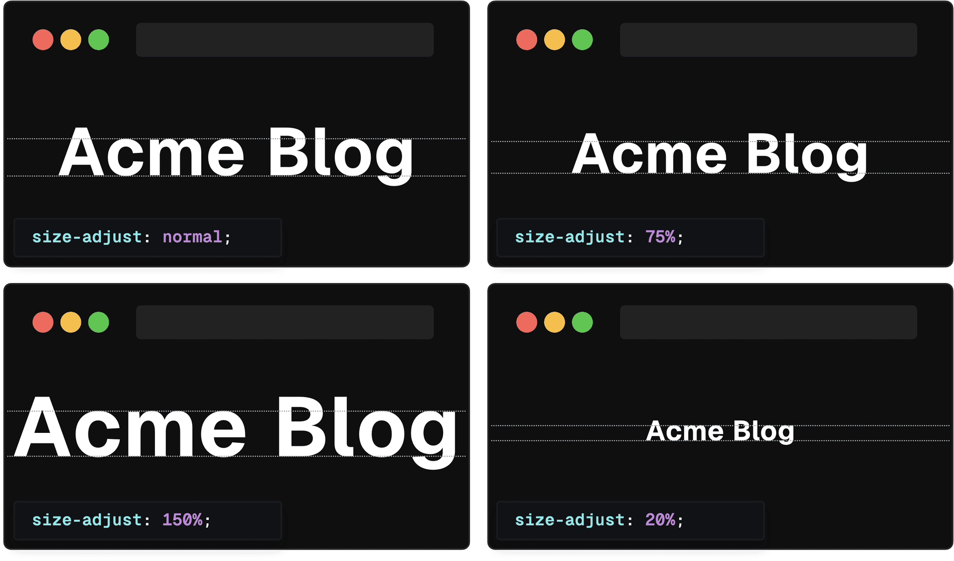
One way to address this issue is by using the size-adjust font-face descriptor.
size-adjust scales all metrics associated with the font by a specified percentage. By adjusting the size to match the web font, the text size will remain (roughly) the same even if the font is swapped from the fallback to the web font. This can help prevent unexpected changes in the page layout.

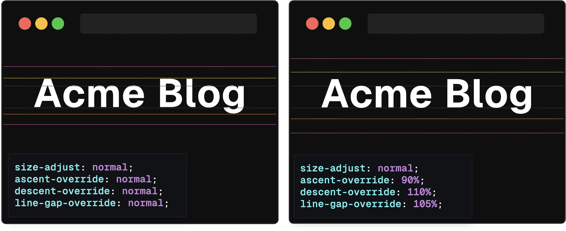
If you want even more control, you can use other CSS descriptors such as ascent-override, descent-override, and line-gap-override to define the ascent metric, descent metric, and line gap.

By using the appropriate fallback font and setting the necessary overrides, you can ensure that your users experience minimal layout shift when the custom font eventually loads in.
Link to headingReducing Download Times
The time it takes to request a web font from the server can be an issue. To speed up this process, we can utilize the preconnect and preload resource hints.
By using preconnect, we instruct the browser to establish a connection to the server hosting the font as soon as the page starts loading. This can significantly improve the speed at which the font is downloaded and displayed.

With preload, we direct the browser to begin fetching the font as early as possible, usually before the browser starts rendering the page. This prevents any potential issues with the font rendering incorrectly or changing while the page is loading, resulting in a seamless user experience.

Link to headingAuto-optimization with next/font
Adding preconnect and font-face descriptors can improve the performance of fonts on your website. It speeds up their loading time and defines their characteristics. However, manually adding these optimizations can be time-consuming and it's easy to forget something.
Ideally, we want our fonts to be optimized automatically. If you're using Next.js, you can use the next/font module to easily add local and Google fonts to your website without worrying about optimization details.
This module handles many tasks for you, including:
Downloading the web font at build time and serving it locally.
Adding a fallback font that closely resembles your web font.
Automatically preloading your font.
At build time, the next/font module downloads the font stylesheet and font files, making them available locally. This eliminates the need for external requests.
The module also provides a custom fallback font that closely matches the intended web font. It even calculates necessary measurements such as size-adjust, ascent-override, descent-override, and line-gap-override at build time.
Lastly, the module preloads fonts when a subset has been defined. This improves both performance and user experience. Preloaded fonts are downloaded as soon as possible, often before the browser renders the page.
By using this module, you can use web fonts worry-free. Your users will likely experience minimal or no layout shift, and no additional developer effort is required.