10 min read
Learn about the differences between image formats, compression techniques, resolution capabilities, pixel density, and effects on user experience.
Images are the most popular resource type on the web, yet understanding the nuances of various image formats and their technical attributes can be challenging.
In this guide, we'll cover the popular image formats JPEG, PNG, WebP, and AVIF. We will discuss their differences in image compression, resolution, pixel density, how these factors affect the way images are presented online, and their impact on user experience.
Before jumping into formats, let’s cover a few important image concepts.
Link to headingCompression Algorithms
Image compression reduces the size of an image file without significantly degrading its visual quality, which is important for fast data transmission and efficient caching. Whether you're viewing a website, sharing a photo over a messaging app, or storing thousands of pictures on a cloud server, image compression plays a critical role.
There are two main types of image compression:
Lossy compression: As the name implies, some data is lost while using this approach. To reduce the file size, less crucial data from the original image is removed. When used excessively, it can cause visible artifacts and a notable drop in image quality, yet it typically results in a reduction in storage requirements.
Lossless compression: This technique ensures that once an image is compressed, it can be perfectly decompressed back to its original state without any data loss. This makes it the perfect option to choose during the encoding process for images needing to retain visual integrity. Several file types, including PNG and some variations of WebP, use lossless compression.
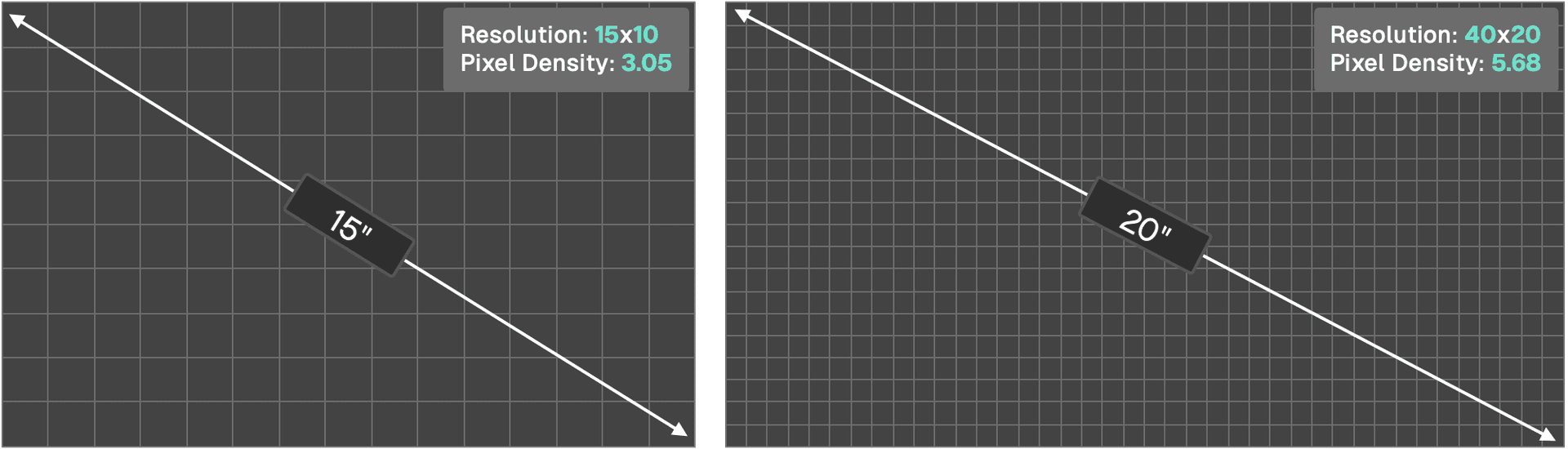
Link to headingPixel Density and Resolution
Pixel density refers to the number of pixels present per unit of display area, typically measured as Pixels Per Inch (PPI).
Resolution is the total count of pixels in an image's width and height. Devices with high pixel densities, e.g. Retina displays, may require images with higher resolutions to appear crisp. However, larger resolutions come at the cost of larger file sizes.
Link to heading
Bit Depth
Bit depth determines the amount of color information stored for each pixel in an image.
A higher bit depth allows for more colors and often results in richer, more nuanced images. A typical 8-bit image can represent 256 colors, while a 16-bit image can represent 65,536 colors.
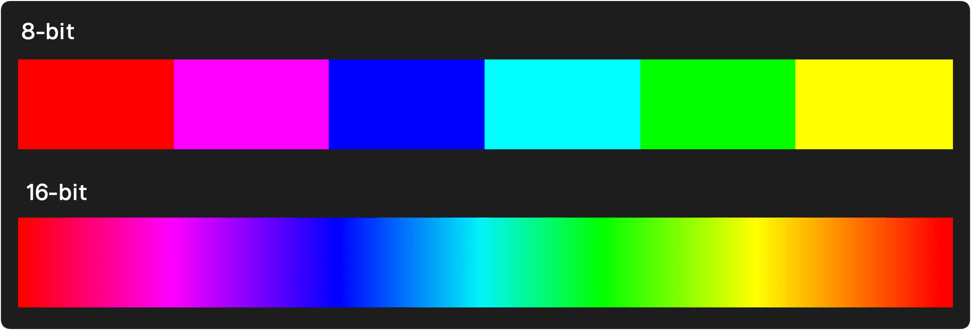
However, this richness comes with a trade-off of a higher file size. Web developers must balance the need for color accuracy with the realities of bandwidth and loading speeds.
Link to headingChroma Subsampling
While the RGB (Red, Green, Blue) paradigm is the most straightforward and commonly recognized color space, it may not always be the most efficient, especially when compression comes into the picture.
Instead, the YCbCr color space plays a key role in both image and video compression.
Y (Luminance): Y stands for the luminance component, which holds the information on how bright or dark a pixel is, completely devoid of its color attributes.
Cb & Cr (Chrominance): These two components encapsulate the color data. Specifically, Cb captures the variance of blue in a pixel relative to its brightness (Y), and Cr represents the variance of red. The green component, interestingly enough, is derived from the Y, Cb, and Cr values rather than being stored directly.
Human eyes are more attuned to changes in brightness (luminance) than color (chrominance). Chroma subsampling reduces the resolution of the chrominance channels (Cb and Cr) more than that of the luminance (Y) channel.
Algorithms for image compression use this characteristic by keeping information where it matters most and reducing data where our eyes are less likely to notice the difference by knowing which areas of a picture are more "forgiving" to data loss or error due to human perception.
Notations like 4:2:2, 4:4:4, and 4:1:1 describe how the chroma channels are subsampled relative to the luma channel.
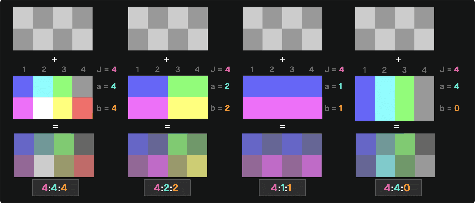
4:4:4: No subsampling. Each pixel has its dedicated luminance (Y) and chrominance (Cr, Cb) values. It has the highest fidelity in color representation, but also the largest data size.4:2:2: For every 4 pixels, the luminance (Y) data is fully preserved, but the chrominance (Cr, Cb) data is averaged for 2 pixels and discarded for the other 2. This reduces file size with a moderate loss in quality.4:1:1: For every 4 pixels, luminance (Y) data is retained, but chrominance (Cr, Cb) data is averaged for 1 pixel and discarded for the other 3. This offers more compression than4:2:2but with a greater loss in color detail.4:4:0: For every 4 pixels in a horizontal line, the luminance (Y) data is individually preserved for each, ensuring full brightness detail. Chrominance (Cr, Cb) data is averaged for 2 pixels and then shared between those 2 pixels on a single row, discarding any chrominance information vertically. This results in color detail being preserved horizontally, but a loss of color fidelity vertically.
The more you subsample (move away from 4:4:4), the smaller our image file becomes. But, if we simplify too much, the colors in our image might not look as true to the original. It's a balance between file size and image quality.
Link to headingProgressive vs. Baseline Loading
The manner in which an image appears on a user's screen can influence their perception of loading speed and overall website performance. Two popular methods for loading images are progressive and baseline.
With baseline loading, images load from top to bottom. When a user visits a web page, they'll first see the top part of the image, and as more data is loaded, the rest of the image gradually reveals itself from top to bottom.
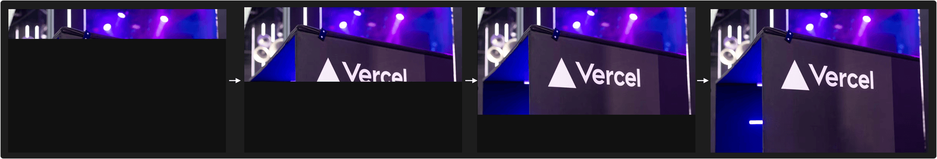
Progressive loading offers a different approach. Instead of displaying an image from top to bottom, the entire image is displayed in a lower quality initially, which gradually improves in quality as more data is loaded. The advantage here is that users get a quick preview of the entire image instantly, which can increase the perceived performance even if the image isn't sharp initially.
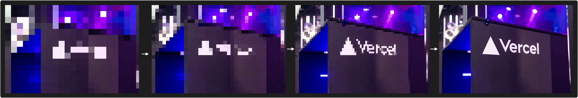
For some image formats, the decision between progressive and baseline loading is made during the encoding phase. This means that when an image is converted to a particular format (e.g. JPEG), it's determined how it will load when displayed. Once encoded in a particular method, it cannot be changed without re-encoding the image.
However, a few newer image formats (WebP, AVIF, and JPEG XL) allow for more flexibility by enabling the choice between progressive and baseline at the decoding phase, when the picture is read and presented. This flexibility is especially useful in dynamic online contexts, as the ideal loading technique may change depending on user conditions like network speeds, device type, browser, or user preferences.
Link to headingAlpha Channel (Transparency)
An alpha channel stores information about the transparency level of each pixel in an image. This is especially useful for web design, allowing images to blend with varying backgrounds seamlessly. Formats like PNG and WebP support the alpha channel, offering transparent backgrounds that can be important for web design elements.
Link to headingMetadata and Exif Data
Images often contain metadata, which is information about the image that isn't directly related to the picture content.
Metadata provides insight into how a particular image was shot by exposing the aperture, shutter speed, ISO settings, and so on. Additionally, the date and geolocation data can create a better UI, or help organize images based on location.
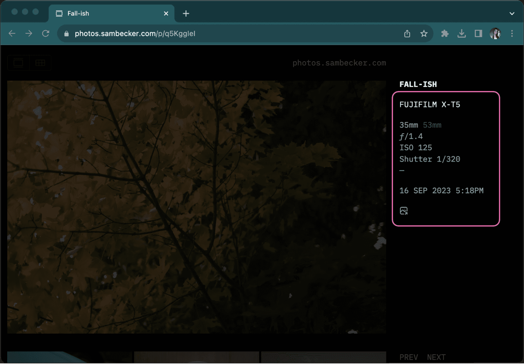
However, while it offers valuable information about the photograph (camera settings, date and time, and optionally even the software used) it can increase the file size.
Additionally, Exif data might cause privacy and security concerns. Users can unknowingly share a picture with the geolocation coordinates of where a photo was taken. They could inadvertently disclose their location or the location of other significant places (like their home, workplace, etc.). This poses obvious risks, from simple privacy breaches to stalking or worse. Libraries like piexifjs can be used to read, edit, and erase Exif data if necessary.
Finally, let's compare the different image formats by looking at their implementation differences and use cases.
Link to headingJPEG (Joint Photographic Experts Group)
JPEG is perhaps the most recognizable image format, having been a staple of the internet and digital photography for decades.
Compression: JPEG primarily uses lossy compression, which means some data is lost during the compression process. JPEG employs the YCbCr color space, uniquely separating an image into its brightness (luminance) and color (chrominance) components, allowing for strategic compression based on the human eye's sensitivities.
Features: JPEG images can be loaded in two ways: baseline and progressive. It doesn’t support transparency, which means all JPEGs have a solid background.
Use Cases: JPEG is best suited for photographs where slight loss of detail is acceptable. Its ability to achieve high compression ratios makes it preferable for web applications where minimizing bandwidth and storage is crucial. For graphics requiring sharp lines or transparency, other formats might be a better choice.
JPEG XL is a next-generation image format and a successor to JPEG, offering both lossless and lossy compression while maintaining backward compatibility and addressing modern image requirements, such as higher dynamic range and faster decoding speeds. However, browser support is still very limited.
Link to headingPNG (Portable Network Graphics)
Developed as a successor to the GIF format, PNG offers a more robust feature set for web graphics.
Compression: PNG provides lossless compression, ensuring every detail of the original image remains intact, even after compression and decompression.
Features: A standout feature of PNG is its support for transparency through an alpha channel. This allows for intricate details like shadows and translucence. PNGs can vary in bit-depth, allowing for a range of colors and file sizes.
Use Cases: PNG is ideal for graphics that demand sharpness and clarity, such as logos, icons, or any design with text. The transparency feature is especially useful for overlaying images on varied backgrounds. However, the lossless compression may result in larger file sizes, which is not always ideal for complex photographs.
Link to headingWebP
Introduced by Google, WebP is a modern contender aiming to supersede both JPEG and PNG in terms of efficiency.
Compression: WebP supports both lossless and lossy compression. Its advanced algorithms often lead to significantly smaller file sizes than both JPEG (at comparable quality) and PNG.
Features: WebP offers transparency similar to PNG and even supports animation (animated WebP).
Use Cases: Due to its versatility, WebP is suitable for various web images, from photographs to intricate graphics. Its efficient compression leads to faster web page loads, but it's essential to check browser compatibility, as not all browsers fully support WebP.
Link to headingAVIF (AV1 Image File Format)
AVIF stems from the AV1 video codec and is created by Alliance for Open Media.
Compression: AVIF has impressive compression capabilities, both lossless and lossy. In many instances, it can outperform WebP in providing a better quality-to-size ratio.
Features: AVIF matches many of WebP's features, including transparency. Its primary advantage is its superior compression, which maintains high quality while reducing file sizes. While AVIF offers impressive compression and quality, one of its primary limitations is the speed of encoding and decoding. AVIF generally takes 20% longer to encode but it compresses 20% smaller compared to WebP. This slower speed can delay image rendering, especially when dealing with larger or multiple files. However, if the image is cached correctly, it will only be slower the first time the image is requested, subsequent (cached) requests will be faster.
Use Cases: Any scenario prioritizing top-notch image quality at minimal file sizes is where AVIF truly shines. As with WebP, its current limitation is browser support.
Link to headingNext.js Image component
Next.js includes built-in Image Optimization using the next/image component which will automatically serve the correct size and format for the device.
You can configure the optimized image formats in next.config.js which will ensure that newer browsers can use newer formats and automatically fall back to older formats for older browsers.
module.exports = { images: { formats: ['image/avif', 'image/webp'], },}This configuration enables AVIF support. If the `images.formats` property is omitted, it defaults to WebP.
This configuration will optimize images to the AVIF format if the browser supports it. If it doesn't, it will use the WebP format. If the browser supports neither format, then the original format is preserved.
Additionally, the component accepts a number of optional properties beyond those which are required, including the quality and sizes prop.
The quality prop relates to the degree of lossy compression applied to an image. A lower quality setting means higher compression, which removes more data, resulting in a smaller file size. However, it also potentially reduces image clarity.
Conversely, a higher quality value will retain more of the image's original data, providing a clearer image but at the cost of a larger file size. In essence, adjusting the quality prop allows you to balance between image fidelity and file size.
// Good quality. A balance between image clarity and file size, suitable for most web use cases. <Image quality={75} />
// Maximum quality. Ensures the best clarity but results in the largest file size.<Image quality={100} />
// Very low quality. The image will be compressed significantly, resulting in a smaller file size but noticeably reduced clarity.<Image quality={33} />The sizes prop informs the browser about the expected display size of the image on various screen sizes or viewport widths. This allows the browser to fetch the best resolution of the image from the srcset, which ensures that high pixel density displays receive higher resolution images for better clarity. Screens with standard pixel density get the usual resolution to conserve bandwidth.
// Takes full viewport width on screens up to 768 pixels wide, otherwise half viewport. Useful for mobile devices in portrait mode.<Image sizes="(max-width: 768px) 100vw, 50vw" />
// Half viewport with on devices up to 768 pixels wide. For devices between 769 and 1200 pixels wide, it will take up a third of the viewport width. Useful for images in multi-column layouts<Image sizes="(max-width: 768px) 50vw, (max-width: 1200px) 33vw, 20vw" />
// Regardless of the device's width, the image will always render at 500 pixels wide.<Image sizes="500px" />
If you omit the sizes prop, Next.js assumes your image has a fixed dimension and handles pixel density appropriately. By including sizes, it tells Next.js that the image is responsive and will change depending on the viewport. Learn more about responsive images in Next.js.
Link to headingConclusion
Choosing the right image format can significantly impact user experience. Factoring in attributes like pixel density, bit depth, and chroma subsampling, along with privacy concerns related to metadata, ensures that images are not just visually appealing but also efficient and secure.