Today, we are announcing an improvement to how usage metrics are delivered to developers and teams on Pro and Enterprise plans.
This dedicated Usage overview visualizes usage data for Teams, making it easier to understand your Team's resource usage, down to specific projects and Serverless Functions.
The Usage overview is split into three main categories that will outline metrics and automated insights about your Team’s projects: Networking, Functions, and Build.
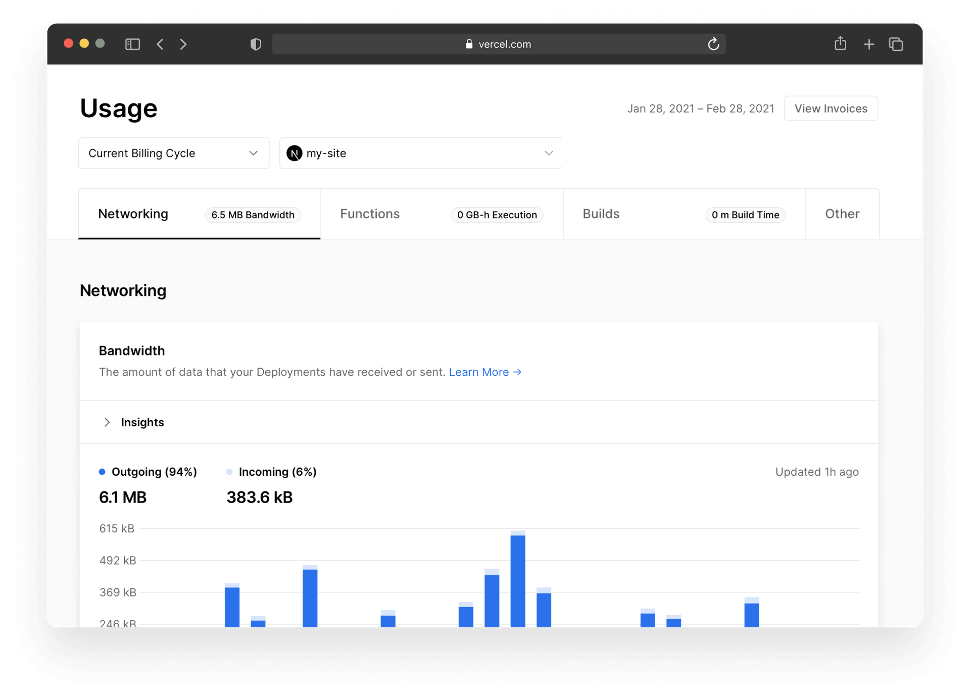
Copy link to headingNetworking
In the Bandwidth section, we provide insight into the amount of traffic that you've received (incoming) versus the amount of data that your Serverless Functions and Edge Network responses send to your customers (outgoing).
This helps you to understand whether your Serverless Functions are sending a lot of data elsewhere (or retrieving it from somewhere), and to make decisions based on that information, if needed.
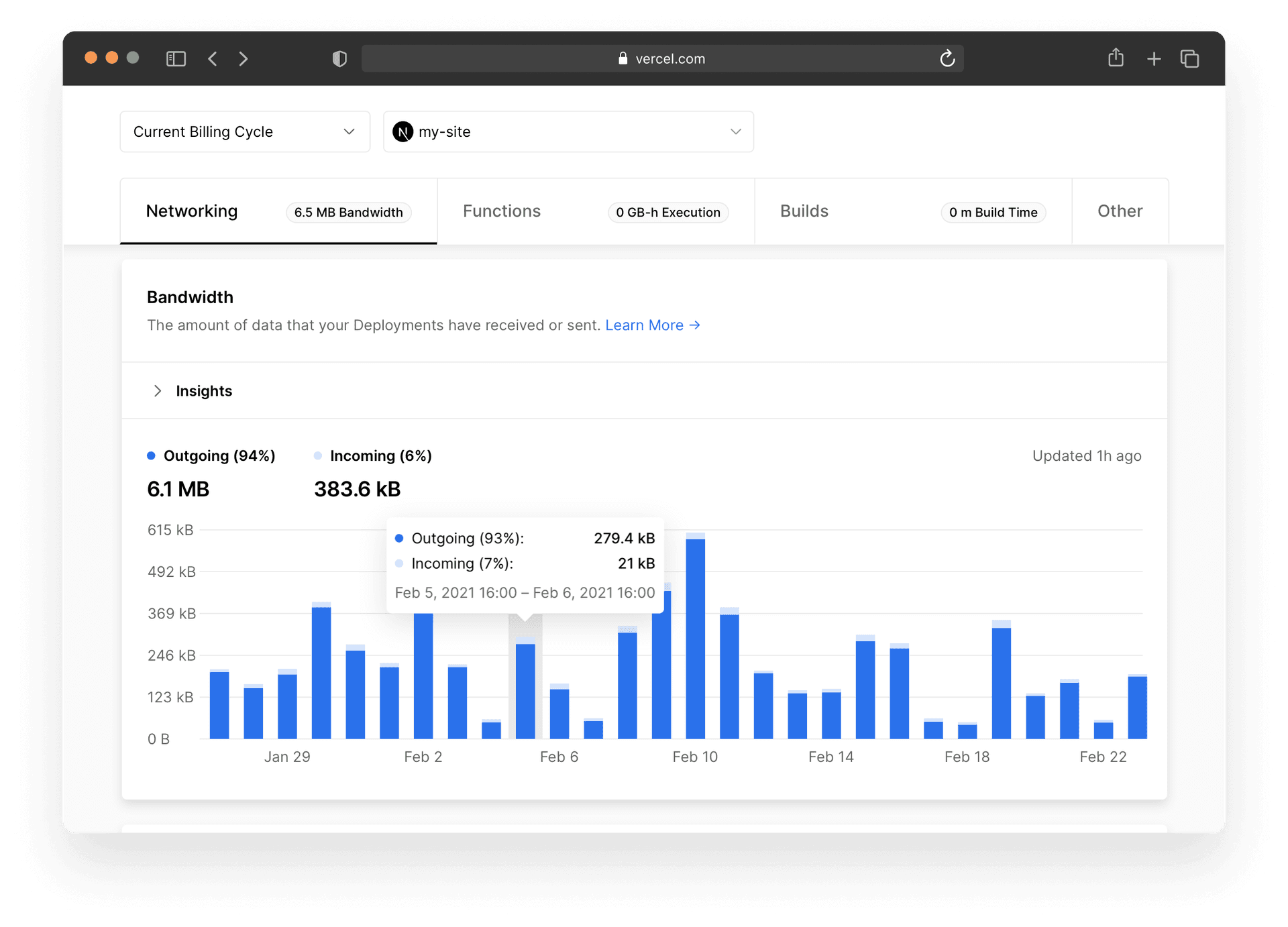
In the Requests section, you'll see the amount of traffic that has hit the cache versus the amount of traffic that hasn't hit the cache.
This usage dashboard makes it easy to see how much of your traffic is cached. The more that is cached, the faster the site. The faster the site, the more delighted your user will be. For more information, read our documentation on Edge Caching.
The goal is stay on top of any networking issues that might come up and keep your visitors and any potential customers happy. Having this information at your fingertips will facilitate this process.
Copy link to headingFunctions
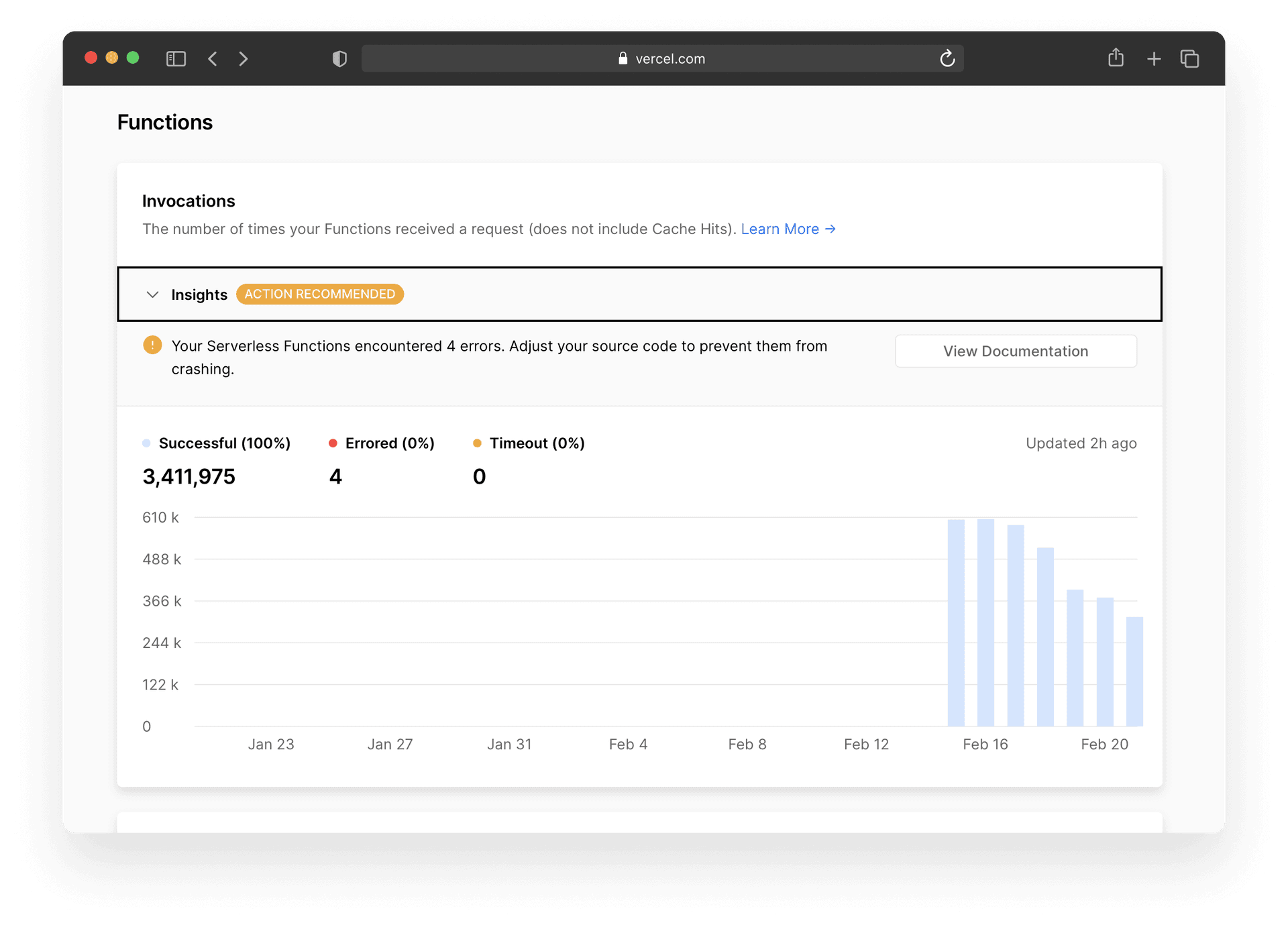
There are two sections in the Functions category that will help you gain insight into how your Serverless Functions are performing.
The Invocations and Executions sections will take a look at how many times a site’s Serverless Functions have been invoked and the time it takes for those Serverless Functions to complete.
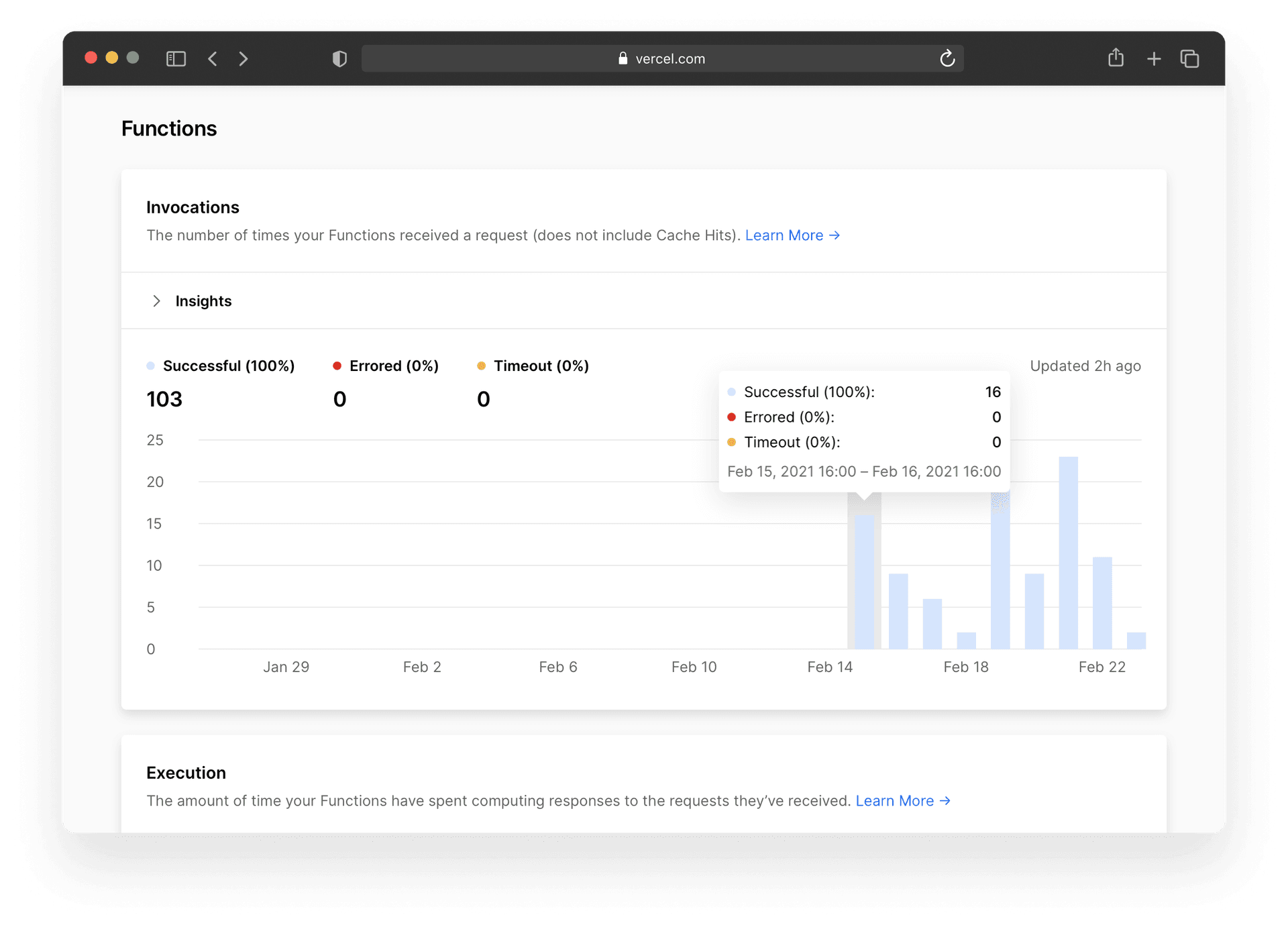
Here you gain insight into two very important metrics as seen in the image above: "Errored" and "Timeout". With "Errored", you can see how many requests to your Serverless Functions have failed and how long they ran before they failed. "Timeout" is a tally of how many times your Serverless Function hit its execution timeout.
The Throttled section will keep track of the number of times a function has been throttled due to concurrency limits being hit. This is where Vercel tried to scale your Serverless Function, but your site received so much traffic, that your deployment couldn't create more functions.
These visualizations will inform workflow so that you can get these numbers can be as close to zero as possible.
Copy link to headingBuilds
In the Builds section, gain insight into how long deployments have been queued, how long it took to build, and keep track of the number of builds a project has had.
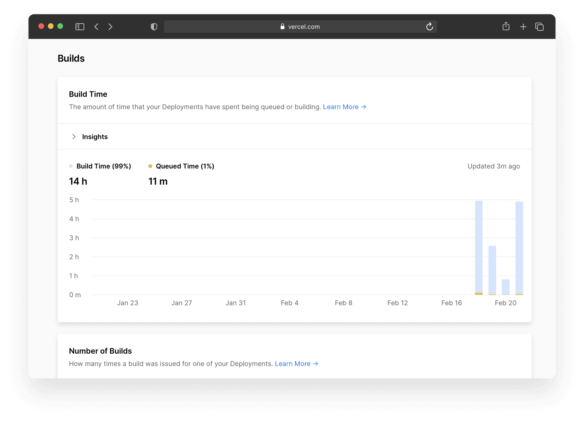
The goal is to optimize your builds so that they take as little time as possible. If your build has been queued for awhile, upgrade your plan to include more concurrent builds to make time-to-production faster.
Copy link to headingWhat Does This Mean For My Team?
Prior to this release, CSVs had to be downloaded and visualized manually, making the process of optimizing a site more cumbersome.
The new Usage overview will make it easier for you to make more informed business decisions because a visualization of all the usage data made available all in one spot.
Based on the data coming in, the Usage overview can also determine if there are actionable recommendations that would improve the site overall. These recommendations can be found in each individual section of the dashboard under Insights.
The Usage overview is enabled by default and is available for Pro and Enterprise plans. If the account is a legacy Team plan, a prompt will open to upgrade to one of Vercel’s newer tiered plans to use this feature.
We hope this will make it easier to visualize usage, gain insight from those visualizations, and optimize your builds based on that data.