10 min read
Fitts' Law, what it really takes to make a complete form error, how to make web-based games playable for all, and more.
We believe the Web should be accessible for everyone. Part of achieving this goal is using best practices on our own work, so we took extra care in making the highly dynamic, WebGL-driven Next.js Conf registration website as accessible as possible.
We also ensure that we enable other developers to ship accessibility by default with Next.js' built-in accessibility features. Whether you're working on a hobby project or are part of a large organization, more people can enjoy your project when you follow proper accessibility practices.
Increase element target size for better usability
Not everyone has finely-tuned control of a mouse so we need to ensure that interactive controls don’t require precise movements. The target sizes of our clickable elements must be large enough for users to easily activate and interact with them.
Let’s look at an example on the Next.js Conf website in the auto-expanding footer.
Our initial implementation made the target size match the size of the font plus some padding. This meant the target was 36px tall which, for some users, is too small.
To address this problem, we used Fitts’ Law: the time to hit a target is a function of the distance to and the size of the target.
For our footer, it’s at the bottom-right corner of the screen and it’s only 36px tall so it will take a lot of time to interact with. A specific problem we found was that the menu would collapse when someone was trying to logout.
If we highlight the target with a red background, we can see why the footer is collapsing.
We shouldn’t expect the user to have precise control of their cursor. To improve this, we increased the touch target size by 12px to make a total target height size of 60px.
Takeaway: Make sure your target sizes are large enough so they’re easily reachable and interactable.
Build with semantic HTML
Screen readers are software that allow non-sighted users to understand and interact with their device. For web applications, they’re able to parse and convey actions and information available for the page.
Because screen readers rely on HTML semantics, poorly constructed HTML will make your pages difficult to interact with for some of your visitors. As the complexity of a page increases, the fundamentals of an HTML document become increasingly more important for handicapped users.
On our website, we built a control that allows attendees to pick the theme for their ticket.
A simple implementation for this control could look like this:
const THEMES = ["a", "b", "c"];
const TicketThemePicker = () => {  const [activeTheme, setActiveTheme] = useState(THEMES[0]);
  return THEMES.map((theme) => (    <button      key={theme}      onClick={() => {        setActiveTheme(theme);      }}    >      <Image src={getImage(theme)} />      {activeTheme === theme && <CheckmarkIcon />}    </button>  ));};
Mapping over array elements to create button images. This code is missing HTML attributes that would improve accessibility.
Most developers will go through a quick mental checklist like this one:
Uses semantic elements (
<button>)Navigating with
TABVisually fits design specifications
They’re able to understand and use this control themselves so it feels like it’s ready to be shipped. But, according to WebAIM and US Census data, up to 20% of the people who visit our website are not able to use this control.
A more robust control
The W3 ARIA group has defined patterns for many complex controls. We picked Radio Group because it satisfies all six parameters of our extended checklist. Here’s the implementation we landed on:
const THEMES = ["a", "b", "c"];
const TicketThemePicker = () => {  const [activeTheme, setActiveTheme] = useState(THEMES[0]);
  return THEMES.map((theme) => (    <React.Fragment key={theme}>      <input        checked={activeTheme === theme}        id={`ticket-theme-${theme}`}        onChange={() => {          setActiveTheme(theme);        }}        type="radio"        value={theme}      />      <label htmlFor={`ticket-theme-${theme}`}>        <Image alt={getDescription(theme)} src={getImage(theme)} />        {activeTheme === theme && <CheckmarkIcon aria-hidden="true" />}      </label>    </>  ));};
An array of controls using inputs with accessibility improvements including type, alt, and aria attributes.
Keyboard interactions meet the specification and we’ve improved the information available to assistive technologies.
Takeaway: When implementing complex controls, refer to the ARIA Patterns for accessible controls to make sure you’re using proven patterns.
Be delightful with alternative text
It can be easy for a well-sighted developer to forget that the amazing visuals on their screen cannot be enjoyed by low-sighted web visitors. But we can still make sure that our non-visual users have a pleasant experience using descriptive language.
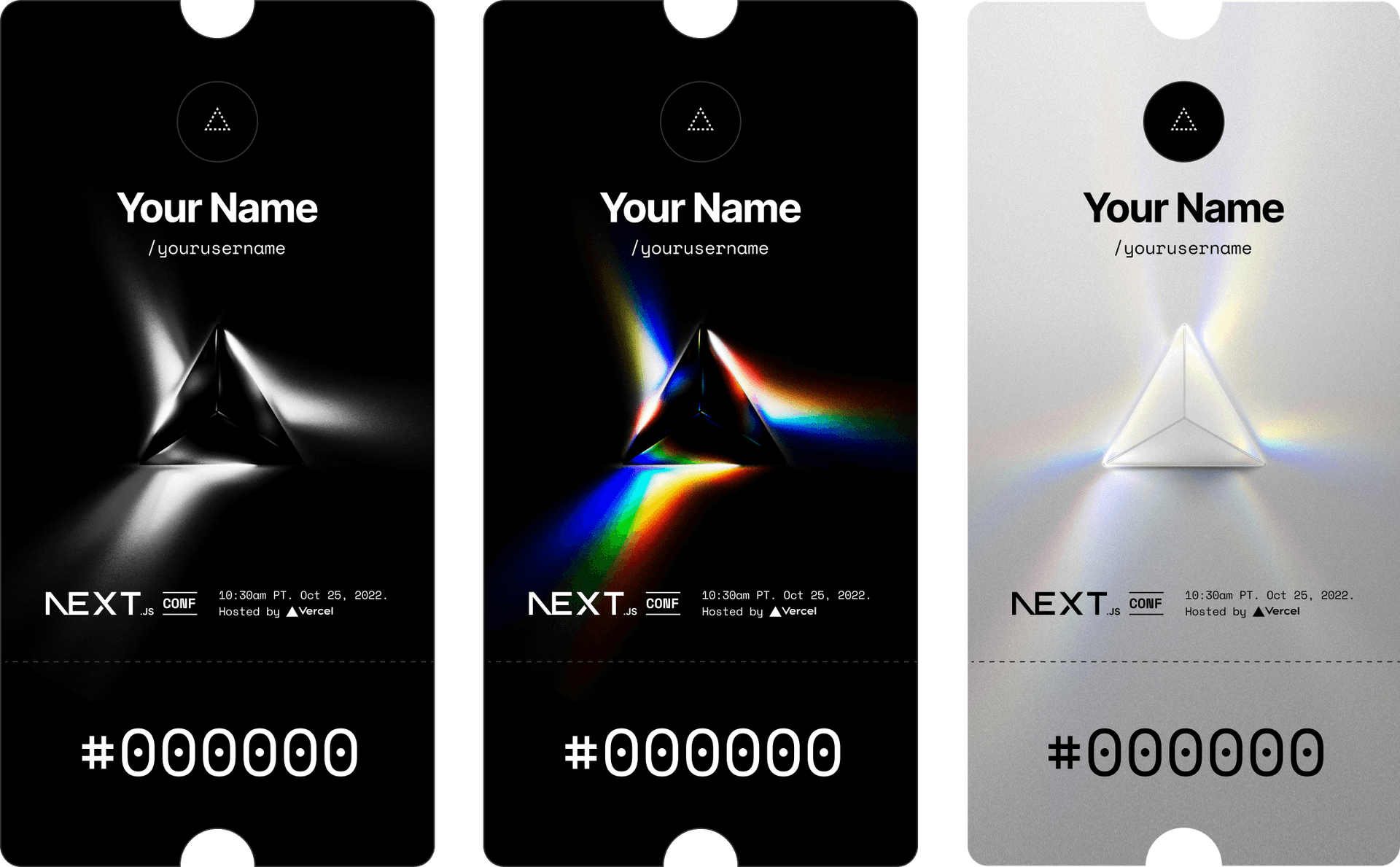
For the descriptions for the ticket themes, we could quickly add some alt text by doing something like:
Ticket theme #1
Ticket theme #2
Ticket theme #3
Better descriptions
While this naively fulfills the basics of the alt text requirement for image, these descriptions don't match the visual interest of the graphics. Instead, we can make sure that our descriptions ensure a similar experience for non-visual users:
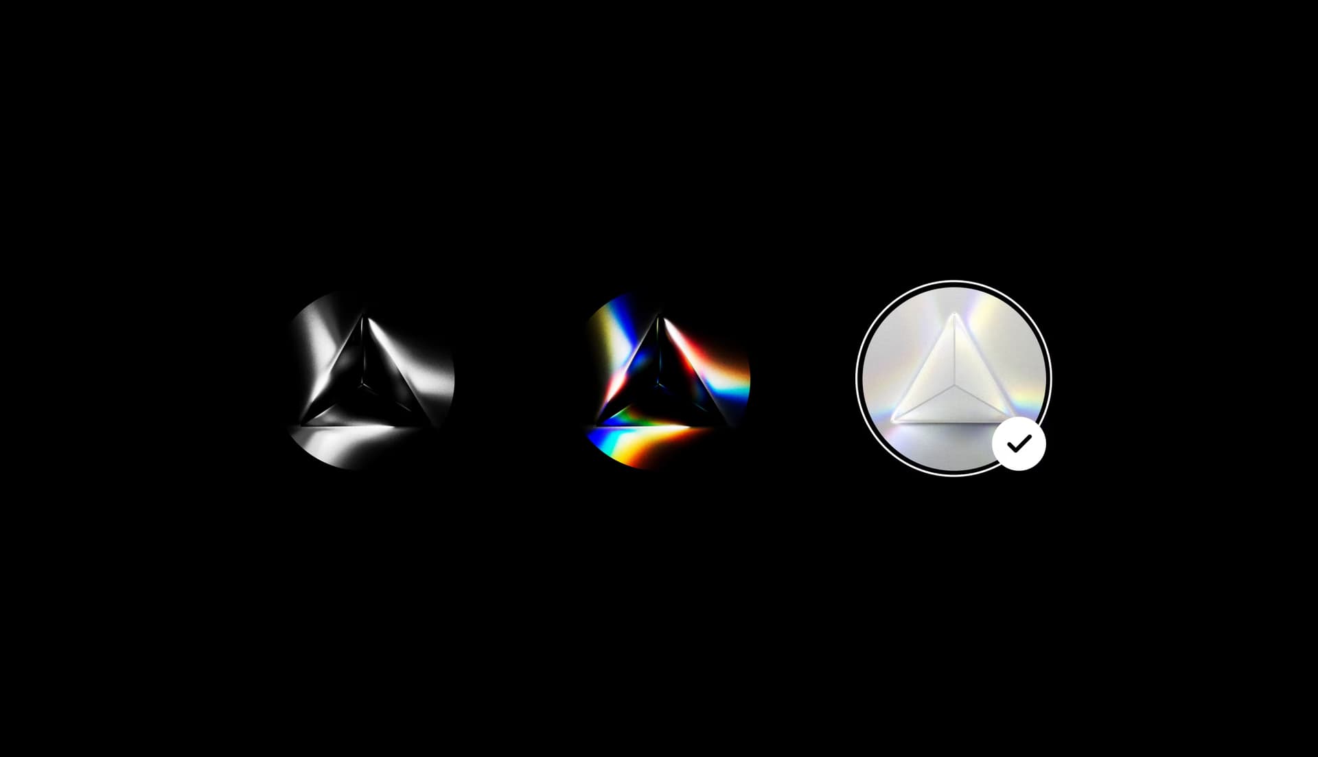
A black and white theme featuring an image of light rays exiting a prism in three directions. The light rays are not vertical but leave the prism at various angles, creating a dynamic composition.
A colored theme featuring an image of light rays exiting a prism in three directions. The light rays split into a rainbow showcasing the full dynamic range of light.
A pure form of illumination, the all-white prism with three light rays is a rare sight to behold. This special edition highlights the simplicity and brilliance of white light.
Takeaway: Your alt text should accurately describe the image that visual users are seeing to deliver the same quality for non-visual users.
Inform with input error messages
Screen readers are software that allow non-sighted users to understand and interact with their device. For web applications, they’re able to parse and convey actions and information available for the page. Because screen readers rely on HTML semantics, a naive implementation might make your forms difficult to interact with for some over your visitors.
If your designs don’t have constraints on how form error messages are shown, then you should use native form validation because they are accessible by default. However, there are many cases where we want to control how error messages are shown.
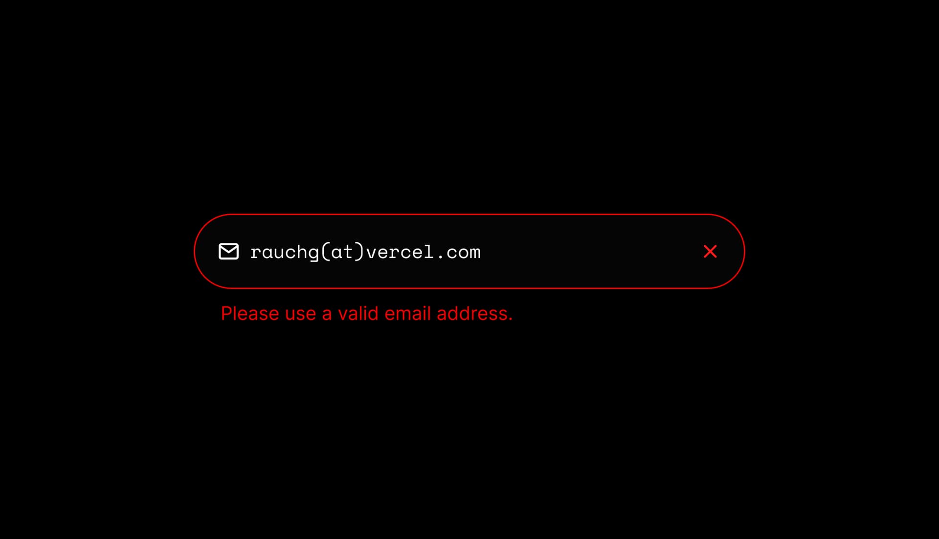
You’ve probably seen this input design before—but have they always been built as accessible as possible? Let’s look at a basic, naive implementation:
const EmailForm = () => {  const [errorMessage, setErrorMessage] = useState(null);
  const onChangeHandler = () => { /* Code to handle change */ }  const onSubmitHandler = () => { /* Code to handle success or error */ }
  return (    <form onSubmit={onSubmitHandler}>      <label htmlFor="email">Email</label>      <input id="email" name="email" onChange={onChangeHandler} />        {          errorMessage && <p>{errorMessage}</p>        }    </form>  )}
This implementation seems right since it displays an error message when an error occurs.
Assistive technology users, however, won’t be notified when the error message shows up. They’ll only know about the error message if they encounter it by chance while navigating the page.
Screen readers are software that allow non-sighted users to understand and interact with their device. For web applications, they’re able to parse and convey actions and information available for the page. Because screen readers rely on HTML semantics, our naive implementation below doesn’t let a screen reader associate the error message with its input. Let's make a few small changes to the line of code for our error message:
const EmailForm = () => {  const [errorMessage, setErrorMessage] = useState(null);
  const onChangeHandler = () => { /* Code to handle change */ }  const onSubmitHandler = () => { /* Code to handle success or error */ }
  return (    <form onSubmit={onSubmitHandler}>      <input onChange={onChangeHandler} />        <p role="alert" aria-atomic="true">{errorMessage}</p>      </form>  )}
First, we’ve made sure the <p> tag is always rendered and has the role="alert" attribute. For screen readers to announce changes, the element needs to already be on the DOM and have an alert role. Now, if the content of the <p> tag changes, assistive technologies will be able to call out this change.
Last, we’ve added the aria-atomic="true" attribute. This tells assistive technologies to announce the full contents of the <p> tag when a change is detected. Without this, an assistive technology will only announce the difference between the last and current contents.
Takeaway: Make sure error messages notify assistive technology users by using the correct HTML semantics.
Reduce motion according to user preferences
It is important to respect a user’s preference for reduced motion, a setting that all major browsers and operating systems support. For some users, excessive motion can cause motion sickness. For others, it can be distracting.
We can use the CSS media query prefers-reduced-motion to detect this preference. On the Next.js Conf registration page, we do a few things when we see this :
Decrease the brightness intensity of the prism
Pause looping animations after 5 seconds
Disable transform and layout animations while keeping animations for other properties like
opacityandbackground-color.
Takeaway: Animations don’t enhance the user experience for everyone. Because of that, we need to provide an opt-out mechanism for animations.
Making Vordle accessible
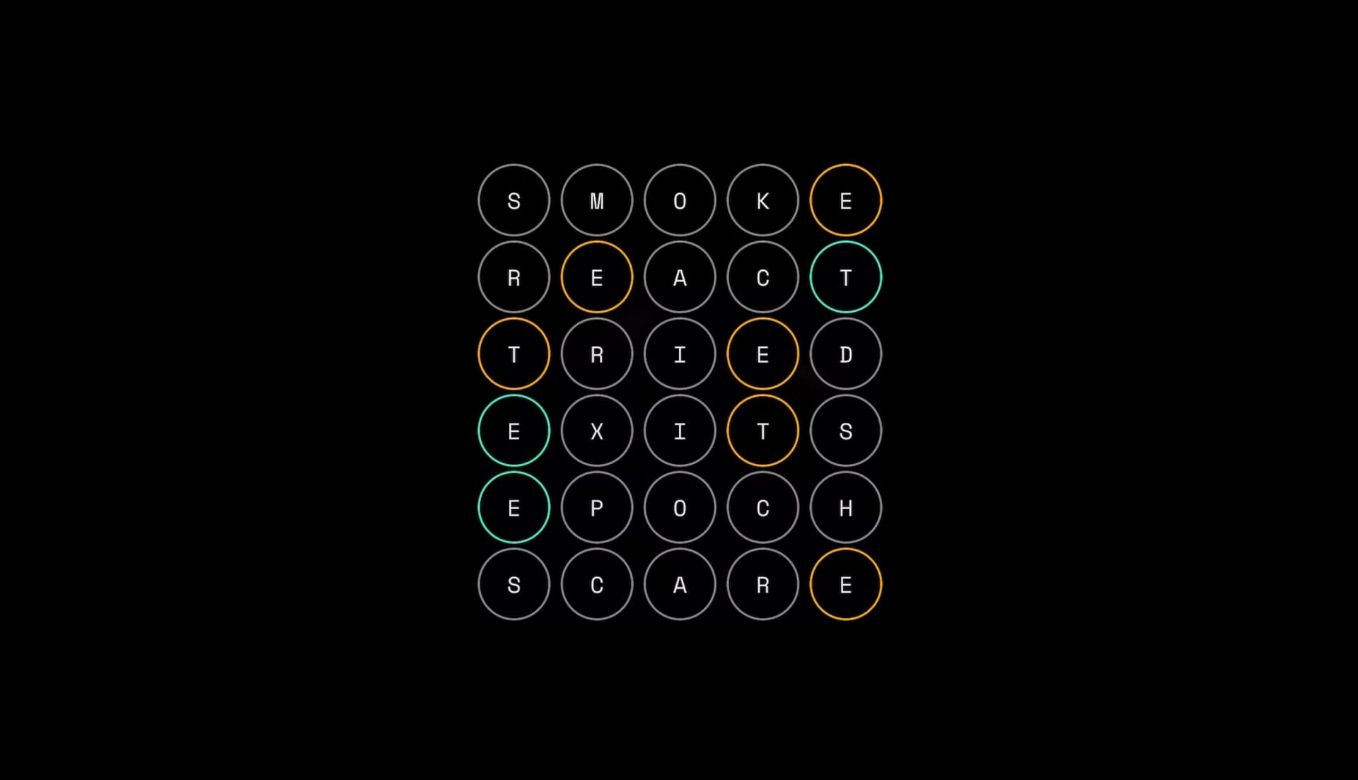
The registration page also features a word game, Vordle, that gives players six chances to guess a five letter word, giving feedback about letters that were correct after each attempt.
Building an accessible game is similar to building an accessible static site—but with a few extra considerations. We had three goals when developing Vordle’s accessibility:
Complete keyboard, mouse, and touch support
Look fantastic for visual users
Sound fantastic for auditory ones
The <table> element works well with screen readers and visual users alike and fits our design perfectly. This meets our first goal well: providing a standardized structure and navigation for both display and screen reader users.
For sighted users, visual clues like animations and colors provide context on the game’s progress and current state. However, to meet our second goal, we also needed an equally descriptive representation of the game state for screen reader users. We used a few strategies to accomplish this:
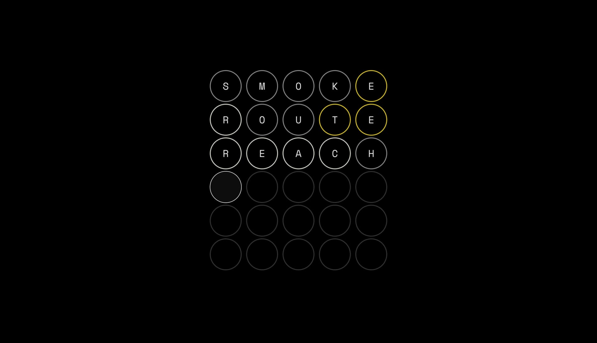
Each row in the table contains a table heading element with descriptive text of their word's score. For example, the first row containing
SCAREabove would read:Guess 1 out of 6: You guessed "smoke" and it was incorrect. Some letters that you guessed are present in the word: "s" is not in the word, "m" is not in the word, "o" is not in the word, "k" is not in the word, "e" is in the word but in the wrong position.
A visually hidden
<h1>on the page (which Next.js route announcer will announce on transitions) explains the game and how the input autofocusing and aforementioned table works. The<h1>also acts as a landmark and is easily navigable by users of assistive technology.We use a visually hidden table
<caption>element to explain how to play the game to screen reader users.
These details make the game itself accessible but there’s one more accessibility-friendly feature we implemented. When you share your score via an OpenGraph image, you can use the og:image:alt property to share what the image represents.
For example, the game below will include lines mentioning:
...game board for Vordle, where they had six chances to guess a secret five-letter word. The game board consists of 6 rows of 5 circles. On their first guess...
Takeaway: If you want your own OpenGraph images to be accessible, be sure to add descriptive alt text to the og:image:alt meta tag. Some websites like Twitter also support their own tags, like twitter:image:alt, but will prioritize a <title> before image:alt.
Listening to our users
Users are the most valuable resource for making websites to be enjoyed by all. Ideally, we would be able to catch any mistakes beforehand—but feedback from hundreds of thousands of people each experiencing the Web in a unique way is nearly impossible to recreate.
After the registration site was released to the public, several individuals on Twitter and one of our own engineers reached out about the Vordle game being unplayable for them. In our work to make the game accessible for screen-readers, we fell short for those with color-blindness.
To help well-sighted developers, browsers provide some tools for emulating vision deficiencies. We will discuss tooling more deeply in a moment—but first here’s what the Vordle game board looks like when emulating Deuteranopia, a form of red-green color-blindness:
To remedy the situation, we introduced some iconography that provides users with an additional way to perceive the state of the game.
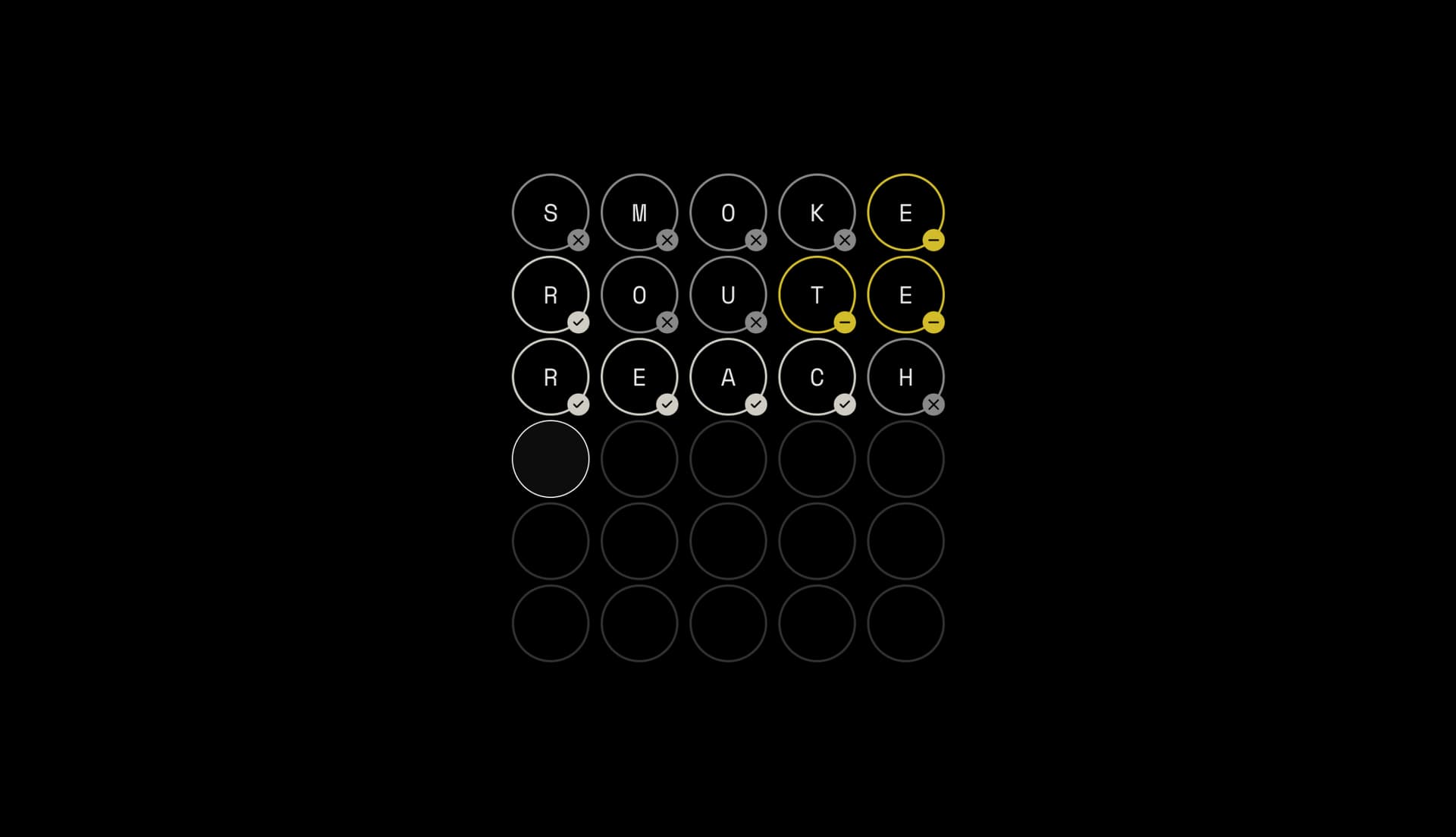
With this change, Vordle is now enjoyable for every user—no matter their form of sightedness.
Sighted users can enjoy a fully visual experience.
Color blind users have iconography to indicate the accuracy of their guesses.
Low or unsighted users can follow audio cues to make their way to correct answers.
Takeaway: Don’t use color as the only signifier for state.
Accessibility tooling for developers
There are many tools and plenty of documentation to help us build accessible applications today. Here’s a list of what we used during our process:
The axe Browser Extension: Audits and teaches you about best practices. Enable automated checks to walk you through the spec in plain language. Visit the extension's home page to add it to your workflow.
Screen readers: A great way to tell if you’ve built an accessible UI is by using a screen reader yourself. Here’s a list of screen readers based on your OS.
Browsers devtools: Modern browsers have built-in tools for working on accessibility. For example, Chrome’s visual deficiency emulation is great for making sure that the colors you’re using are accessible to folks with different types of vision deficiencies.
Here’s a guide on how to use it. Additionally, the accessibility pane helps you debug for information that assistive technologies use.
Web Accessibility Documentation: a11y Project, the MDN accessibility area, and the WCAG website all provide extensive information on web accessibility.
There are many tools that will help us build accessible websites, but the best way is to have real developers and users who rely on assistive technologies build and use your website. Building empathy for assistive technology users takes time and the best way to build that relationship is by talking to your users.
Headed to Next.js Conf?
Visit the Next.js Conf registration page to see our accessibility changes in action—and sign up to get your free ticket if you haven’t yet! We’re looking forward to the most popular, most accessible Next.js Conf we’ve ever held. See you there.
Want to get started with Next.js on Vercel? Here's a trial to get you deploying on the only infrastructure that will always support the latest Next.js features the moment they release.