We recently released v0 for iOS, Vercel’s first mobile app. As a company focused on the web, building a native app was new territory for us.
Our goal was to build an app worthy of an Apple Design Award, and we were open-minded on the best tech stack to get there. To that end, we built dozens of iterations of the product prior to our public beta. We experimented with drastically different tech stacks and UI patterns.
We took inspiration from apps which speak the iPhone’s language, such as Apple Notes and iMessage. v0 had to earn a spot on your Home Screen among the greats.
After weeks of experimentation, we landed on React Native with Expo to achieve this. We are pleased with the results, and our customers are too. In fact, the influx of messages from developers asking how the app feels so native compelled us to write a technical breakdown of how we did it.
Copy link to headingTable of contents
Copy link to headingHow we built the v0 chat experience
When you’re away from your computer, you might have a quick idea you want to act on. Our goal was to let you turn that idea into something tangible, without requiring context switching. v0 for iOS is the next generation of your Notes app, where your ideas get built in the background.
We did not set out to build a mobile IDE with feature parity with our website. Instead, we wanted to build a simple, delightful experience for using AI to make things on the go. The centerpiece of that experience is the chat.
To build a great chat, we set the following requirements:
New messages animate in smoothly
New user messages scroll to the top of the screen
Assistant messages fade in with a staggered transition as they stream
The composer uses Liquid Glass and floats on top of scrollable content
Opening existing chats starts scrolled to the end
Keyboard handling feels natural
The text input lets you paste images and files
The text input supports pan gestures to focus and blur it
Markdown is fast and supports dynamic components
While a number of UI patterns have emerged for AI chat in mobile apps, there is no equivalent set of patterns for AI code generation on mobile.
We hadn’t seen these features in existing React Native apps, so we found ourselves inventing patterns on the fly. It took an extraordinary amount of work, testing, and coordination across each feature to make it meet our standards.
Copy link to headingBuilding a composable chat
To meet our requirements, we structured our chat code to be composable on a per-feature basis.
Our chat is powered by a few open source libraries: LegendList, React Native Reanimated, and React Native Keyboard Controller. To start, we set up multiple context providers.
export function ChatProvider({ children }) { return ( <ComposerHeightProvider> <MessageListProvider> <NewMessageAnimationProvider> <KeyboardStateProvider>{children}</KeyboardStateProvider> </NewMessageAnimationProvider> </MessageListProvider> </ComposerHeightProvider> )}The provider wraps the MessagesList:
export function ChatMessagesList({ chatId }) { const messages = useMessages({ chatId }).data return ( <ChatProvider key={chatId}> <MessagesList messages={messages} /> </ChatProvider> )}Next, our messages list implements these features as composable plugins, each with its own hook.
function MessagesList({ messages }) { useKeyboardAwareMessageList() useScrollMessageListFromComposerSizeUpdates() useUpdateLastMessageIndex() const { animatedProps, ref, onContentSizeChange, onScroll } = useMessageListProps() return ( <AnimatedLegendList animatedProps={animatedProps} ref={ref} onContentSizeChange={onContentSizeChange} onScroll={onScroll} enableAverages={false} data={messages} keyExtractor={(item) => item.id} renderItem={({ item, index }) => { if (item.role === 'user') { return <UserMessage message={item} index={index} /> } if (item.role === 'assistant') { return <AssistantMessage message={item} index={index} /> } if (item.role === 'optimistic-placeholder') { return <OptimisticAssistantMessage index={index} /> } }} /> )}The following sections break down each hook to demonstrate how they work together.
Copy link to headingSending your first message
When you send a message on v0, the message bubble smoothly fades in and slides to the top. Immediately after the user message is done animating, the assistant messages fade in.
When the user sends a message, we set a Reanimated shared value to indicate the animation should begin. Shared values let us update state without triggering re-renders.
const { isMessageSendAnimating } = useNewMessageAnimation()const chatId = useChatId()
const onSubmit = () => { const isNewChat = !chatId if (isNewChat) { isMessageSendAnimating.set(true) } send()}Setting the animation state on submit
With our state tracked in Reanimated, we can now animate our UserMessage.
export function UserMessage({ message, index }) { const isFirstUserMessage = index === 0 const { style, ref, onLayout } = useFirstMessageAnimation({ disabled: !isFirstUserMessage, }) return ( <Animated.View style={style} ref={ref} onLayout={onLayout}> <UserMessageContent message={message} /> </Animated.View> )}Wrapping the user message in an animated view
Notice that UserMessageContent is wrapped with an Animated.View which receives props from useFirstMessageAnimation.
Copy link to headingHow useFirstMessageAnimation works
This hook is responsible for 3 things:
Measure the height of the user message with
itemHeight, a Reanimated shared valueFade in the message when
isMessageSendAnimatingSignal to the assistant message that the animation is complete
export function useFirstMessageAnimation({ disabled }) { const { keyboardHeight } = useKeyboardContextState() const { isMessageSendAnimating } = useNewMessageAnimation() const windowHeight = useWindowDimensions().height const translateY = useSharedValue(0) const progress = useSharedValue(-1) const { itemHeight, ref, onLayout } = useMessageRenderedHeight() useAnimatedReaction( () => { const didAnimate = progress.get() !== -1 if (disabled || didAnimate || !isMessageSendAnimating.get()) { return -1 } return itemHeight.get() }, (messageHeight) => { if (messageHeight <= 0) return const animatedValues = getAnimatedValues({ itemHeight: messageHeight, windowHeight, keyboardHeight: keyboardHeight.get(), }) const { start, end, duration, easing, config } = animatedValues translateY.set( // initialize values at the "start" state with duration 0 withTiming(start.translateY, { duration: 0 }, () => { // next, transition to the "end" state translateY.set(withSpring(end.translateY, config)) }) ) progress.set( withTiming(start.progress, { duration: 0 }, () => { progress.set(withTiming(end.progress, { duration, easing }), () => { isMessageSendAnimating.set(false) }) }) ) } ) const style = useAnimatedStyle(...) const didUserMessageAnimate = useDerivedValue(() => progress.get() === 1) return { style, ref, onLayout, didUserMessageAnimate }}The useFirstMessageAnimation hook
Thanks to React Native’s New Architecture, ref.current.measure() in useLayoutEffect is synchronous, giving us height on the first render. Subsequent updates fire in onLayout.
Based on the message height, window height, and current keyboard height, getAnimatedValues constructs the easing, start, and end states for translateY and progress. The resulting shared values are passed to useAnimatedStyle as transform and opacity respectively.
And there we have it. Our first message fades in using Reanimated. Once it’s done animating, we’re ready to fade in the first assistant message response.
Copy link to headingFading in the first assistant message
Similar to UserMessage, the assistant message content is wrapped in an animated view that fades in after the user message animation completes.
function AssistantMessage({ message, index }) { const isFirstAssistantMessage = index === 1 const { didUserMessageAnimate } = useFirstMessageAnimation({ disabled: !isFirstAssistantMessage, })
const style = useAnimatedStyle(() => ({ opacity: didUserMessageAnimate.get() ? withTiming(1, { duration: 350 }) : 0, })) return ( <Animated.View style={style}> <AssistantMessageContent message={message} /> </Animated.View> )}Fading in after the user message animation completes
This fade in behavior is only enabled for the first assistant message in the chat, where index === 1. Messages in existing chats will have different behavior than messages in new chats.
What happens if you open an existing chat that has one user message and one assistant message? Will it animate in again? No, because the animations here only apply if isMessageSendAnimating is true, which gets set onSubmit and cleared when you change chats.
Copy link to headingSending messages in an existing chat
We’ve covered how v0 handles animating in messages for new chats. For existing chats, however, the logic is entirely distinct. Rather than rely on Reanimated animations, such as the one in useFirstMessageAnimation, we rely on an implementation of scrollToEnd().
So all we need to do is scroll to end if we’re sending a message in an existing chat, right?
useEffect(function onNewMessage() { const didNewMessageSend = // ...some logic if (didNewMessageSend) { listRef.current?.scrollToEnd() }}, ...)The naive approach
In a perfect world, this is all the logic we’d need. Let’s explore why it’s not enough.
If you recall from the introduction, one of our requirements is that new messages have to scroll to the top of the screen. If we simply call scrollToEnd(), then the new messages will show at the bottom of the screen.
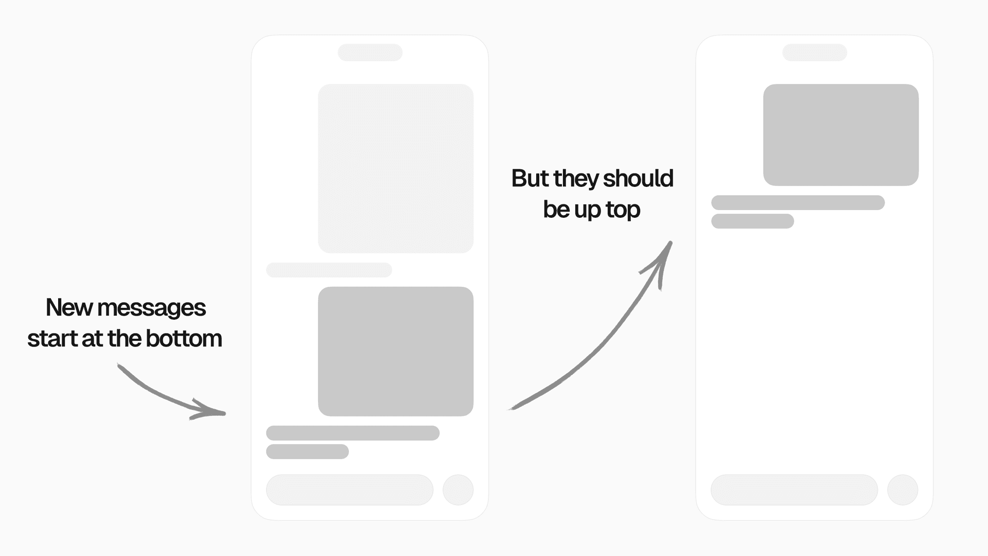
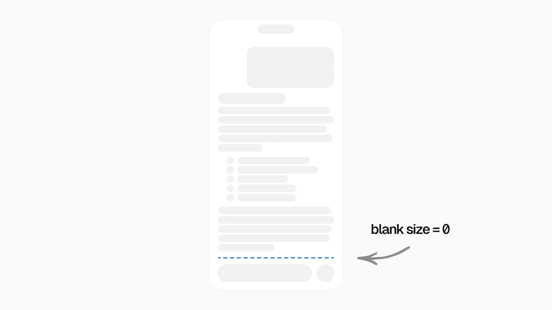
We needed a strategy to push the user message to the top of the chat. We referred to this as “blank size”: the distance between the bottom of the last assistant message, and the end of the chat.
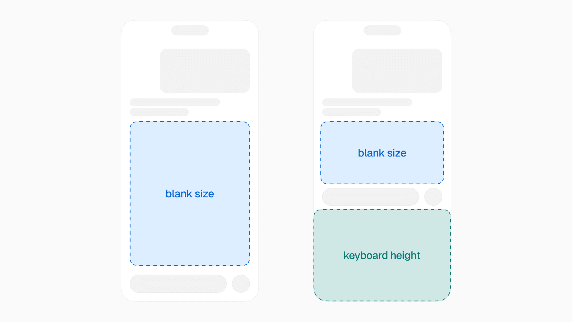
To float the content to the top of the chat, we had to push it up by the amount equal to the blank size. Thanks to synchronous height measurements in React Native's New Architecture, this was possible to do on each frame without a flicker. But it still required a lot of trickery and coordination.
In the image above, you’ll notice that the blank size is dynamic. Its height depends on the keyboard’s open state. And it can change on every render, since the assistant message streams in quickly and with unpredictable sizes.
Dynamic heights are a common challenge in virtualized lists. The frequently-updating blank size took that challenge to a new level. Our list items have dynamic, unknown heights that update frequently, and we need them to float to the top.
For long enough assistant messages, the blank size could be zero, which introduced a new set of edge cases.
Copy link to headingHow we solved it
We tried many different approaches to implementing blank size. We tried a View at the bottom of the ScrollView with height, bottom padding on the ScrollView itself, translateY on the scrollable content, and minimum height on the last system message. All of these ended up with strange side effects and poor performance, often due to the need for a layout with Yoga.
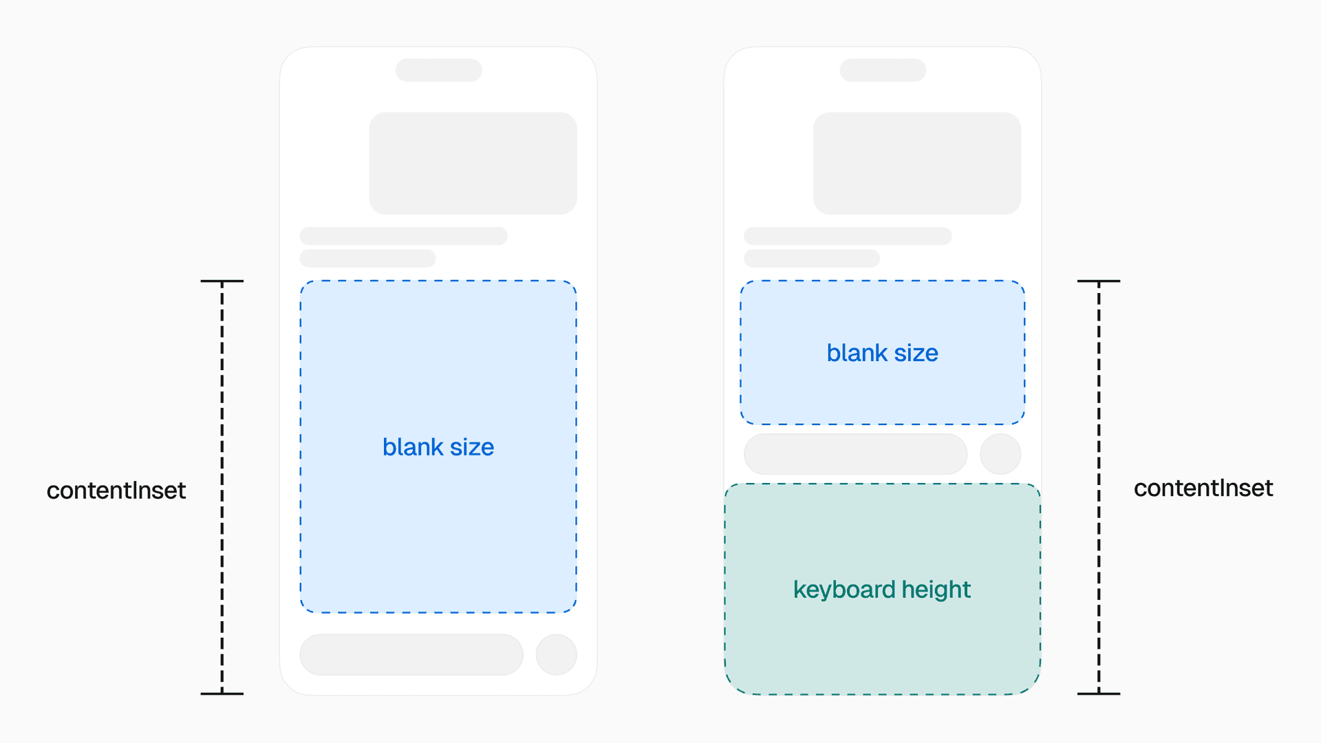
We ultimately landed on a solution that uses the contentInset property on ScrollView to handle the blank size without jitters. contentInset maps directly to the native property on UIScrollView in UIKit.
We then paired contentInset together with scrollToEnd({ offset }) when you send a message.
An assistant message’s blank size is determined by the combination of its own height, the height of the user message that comes before it, and the height of the chat container.
Copy link to headingImplementing useMessageBlankSize
To implement blank size, we start with a hook called useMessageBlankSize in the assistant message:
function AssistantMessage({ message, index }) { // ...styling logic const { onLayout, ref } = useMessageBlankSize({ index }) return ( <Animated.View ref={ref} onLayout={onLayout}> <AssistantMessageContent message={message} /> </Animated.View> )}useMessageBlankSize is responsible for the following logic:
Synchronously measure the assistant message
Measure the user message before it
Calculate the minimum distance for the blank size below the assistant message
Keep track of what the blank size should be when the keyboard is opened or closed
Set the
blankSizeshared value at the root context provider
Lastly, we consume blankSize and pass it to the contentInset of our ScrollView:
export function MessagesList(props) { const { blankSize, composerHeight, keyboardHeight } = useMessageListContext()
const animatedProps = useAnimatedProps(() => { return { contentInset: { bottom: blankSize.get() + composerHeight.get() + keyboardHeight.get(), }, } })
return <AnimatedLegendList {...props} animatedProps={animatedProps} />}Passing blankSize to contentInset
useAnimatedProps from Reanimated lets us update props on the UI thread on each frame without triggering re-renders. contentInset saw great performance and worked far better than every previous attempt.
Copy link to headingTaming the keyboard
Building a good chat experience hinges on elegant keyboard handling. Achieving native feel in this area was tedious and challenging with React Native. When v0 iOS was in public beta, Apple released iOS 26. Every time a new iOS beta version came out, our chat seemingly broke entirely. Each iOS release turned into a game of cat-and-mouse of reproducing tiny discrepancies and jitters.
Luckily, Kiryl, the maintainer of react-native-keyboard-controller, helped us address these issues, often updating the library within 24 hours of Apple releasing a new beta.
Copy link to headingBuilding useKeyboardAwareMessageList
We used many of the hooks provided by React Native Keyboard Controller to build our own keyboard management system tailored to v0’s chat.
useKeyboardAwareMessageList is our custom React hook responsible for all of our keyboard handling logic. We render it alongside our chat list, and it abstracts away everything we need to make the keyboard feel right.
function MessagesList() { useKeyboardAwareMessageList() // ...rest of the message list}Consuming useKeyboardAwareMessageList
While the consumption is a one liner, its internals are about 1,000 lines of code with many unit tests. useKeyboardAwareMessageList primarily relies on the upstream useKeyboardHandler, handling events like onStart, onEnd, and onInteractive, together with a number of Reanimated useAnimatedReaction calls to retry events in particular edge cases.
useKeyboardAwareMessageList also handles a number of strange behaviors in iOS. For example, if you send an app to the background when the keyboard is open and then refocus the app, iOS will inexplicably fire the keyboard onEnd event three times. Because we relied on imperative behavior when events fired, we came up with tricks to dedupe repeat events and track app state changes.
useKeyboardAwareMessageList implements the following features:
Shrink the
blankSizewhen the keyboard opensIf you’re scrolled to the end of the chat, and there’s no blank size, shift content up when the keyboard opens
If you have scrolled high up enough, and there’s no blank size, show the keyboard on top of the content, without shifting the content itself
When the user interactively dismisses the keyboard via the scroll view or text input, drag it down smoothly
If you’re scrolled to the end of the chat, and the blank size is bigger than the keyboard, the content should stay in place
If you’re scrolled to the end of the chat and the blank size is greater than zero, but it should be zero when the keyboard is open, shift content up so that it lands above the keyboard
There was no single trick to get this all working. We spent dozens of hours using the app, noticing imperfections, tracing issues, and rewriting the logic until it felt right.
Copy link to headingScrolling to end initially
When you open an existing chat, v0 starts the chat scrolled to end. This is similar to using the inverted prop on React Native’s FlatList , which is common for bottom-to-top chat interfaces.
However, we decided not to use inverted since it felt incompatible with an AI chat where messages stream in multiple times per second. We opted not to autoscroll as the assistant message streams. Instead, we let the content fill in naturally under the keyboard, together with a button to scroll to the end. This follows the same behavior as ChatGPT’s iOS app.
That said, we wanted an inverted-list-style experience when you first opened an existing chat. To make this work, we call scrollToEnd when a chat first becomes visible.
Due to a complex combination of dynamic message heights and blank size, we had to call scrollToEnd multiple times. If we didn’t, our list would either not scroll properly, or scroll too late. Once the content has scrolled, we call hasScrolledToEnd.set(true) to fade in the chat.
import { scheduleOnRN } from 'react-native-worklets'
export function useInitialScrollToEnd(blankSize, scrollToEnd, hasMessages) { const hasStartedScrolledToEnd = useSharedValue(false) const hasScrolledToEnd = useSharedValue(false) const scrollToEndJS = useLatestCallback(() => { scrollToEnd({ animated: false }) // Do another one just in case because the list may not have fully laid out yet requestAnimationFrame(() => { scrollToEnd({ animated: false })
// and another one again in case setTimeout(() => { scrollToEnd({ animated: false })
// and yet another! requestAnimationFrame(() => { hasScrolledToEnd.set(true) }) }, 16) }) })
useAnimatedReaction( () => { if (hasStartedScrolledToEnd.get() || !hasMessages) { return false } return blankSize.get() > 0 }, (shouldScroll) => { if (shouldScroll) { hasStartedScrolledToEnd.set(true) scheduleOnRN(scrollToEndJS) } } )
return hasScrolledToEnd}Calling scrollToEnd multiple times to handle dynamic heights
Copy link to headingFloating composer
Inspired by iMessage’s bottom toolbar in iOS 26, we built a Liquid Glass composer with a progressive blur.
We used @callstack/liquid-glass to add interactive Liquid Glass. By wrapping the glass views with LiquidGlassContainerView, we automatically get the view morphing effect.
<LiquidGlassContainerView spacing={8}> <LiquidGlassView interactive>...</LiquidGlassView> <LiquidGlassView interactive>...</LiquidGlassView></LiquidGlassContainerView>Adding Liquid Glass to the composer
Copy link to headingMake it float
After adding the Liquid Glass, the next step was making it float on top of the chat content.
In order to make the composer float on top of the scrollable content, we took the following steps:
Add
position: absolute; bottom: 0to the composerWrap the composer in
KeyboardStickyViewfromreact-native-keyboard-controllerSynchronously measure the composer, and store its height in context using a shared value
Add the
composerHeight.get()to our ScrollView’s nativecontentInset.bottomproperty
function Composer() { const { composerHeight } = useComposerHeightContext() const { onLayout, ref } = useSyncLayoutHandler((layout) => { composerHeight.set(layout.height) }) const insets = useInsets() return ( <KeyboardStickyView style={{ position: 'absolute', bottom: 0, left: 0, right: 0 }} offset={{ closed: -insets.bottom, opened: -8 }} > <View ref={ref} onLayout={onLayout} > {/* ... */} </View> </KeyboardStickyView> )}Positioning the composer with KeyboardStickyView
However, this was not enough. We are still missing one key behavior.
As you type, the text input’s height can increase. When you type new lines, we want to simulate the experience of typing in a regular, non-absolute-positioned input. We had to find a way to shift the chat messages upwards, but only if you are scrolled to the end of the chat.
In the video below, you can see both cases. At the start of the video, content shifts up with new lines since the chat is scrolled to the end. However, after scrolling up in the chat, typing new lines will not shift the content.
Copy link to headinguseScrollWhenComposerSizeUpdates
Enter useScrollWhenComposerSizeUpdates. This hook listens to the height of the composer and automatically scrolls to end when needed. To consume it, we simply call it in MessagesList:
export function MessagesList() { useScrollWhenComposerSizeUpdates() // ...message list code }Consuming useScrollWhenComposerSizeUpdates
First, it sets up an effect using useAnimatedReaction to track composer height changes.
Next, we call autoscrollToEnd. As long as you’re close enough to the end of the scrollable area, we automatically scroll to the end of the chat. Without this, entering new lines in the composer would overlap the bottom of the scrollable area.
useScrollWhenComposerSizeUpdates lets us conditionally simulate the experience of a view that is not absolute-positioned.
export function useScrollWhenComposerSizeUpdates() { const { listRef, scrollToEnd } = useMessageListContext() const { composerHeight } = useComposerHeightContext()
const autoscrollToEnd = () => { const list = listRef.current if (!list) { return }
const state = list.getState() const distanceFromEnd = state.contentLength - state.scroll - state.scrollLength
if (distanceFromEnd < 0) { scrollToEnd({ animated: false }) // wait a frame for LegendList to update, and fire it again setTimeout(() => { scrollToEnd({ animated: false }) }, 16) } }
useAnimatedReaction( () => composerHeight.get(), (height, prevHeight) => { if (height > 0 && height !== prevHeight) { scheduleOnRN(autoscrollToEnd) } } )}Scrolling to end when the composer grows
As we saw in earlier code, we unfortunately relied on a number of setTimeout and requestAnimationFrame calls to scrollToEnd. That code will understandably raise eyebrows, but it was the only way we managed to get scrolling to end working properly. We’re actively collaborating with Jay, the maintainer of LegendList, to build a more reliable approach.
Copy link to headingMake it feel native
React Native’s built-in TextInput felt out of place in a native chat app.
By default, when you set multiline={true}, the TextInput shows ugly scroll indicators, which is inconsistent with most chat apps. Swiping up and down on the input will bounce its internal content, even if you haven’t typed any text yet. Additionally, the input doesn't support interactive keyboard dismissal.
To fix these issues, we applied a patch to RCTUITextView in native code. This patch disables scroll indicators, removes bounce effects, and enables interactive keyboard dismissal.
Our patch also adds support for swiping up to focus the input. We realized we needed this after watching testers frustratingly swipe up expecting the keyboard to open.
diff --git a/Libraries/Text/TextInput/Multiline/RCTUITextView.mm b/Libraries/Text/TextInput/Multiline/RCTUITextView.mmindex 6e9c3841cee19632eaa59ae2dbd541a85ce7cabf..e3f920acbc2bb074582ed2b531ddd90e2017d59c 100644--- a/Libraries/Text/TextInput/Multiline/RCTUITextView.mm+++ b/Libraries/Text/TextInput/Multiline/RCTUITextView.mm@@ -55,6 +55,16 @@ - (instancetype)initWithFrame:(CGRect)frame self.textContainer.lineFragmentPadding = 0; self.scrollsToTop = NO; self.scrollEnabled = YES;++ // Fix bouncing, scroll indicator, and keyboard mode gesture+ self.showsVerticalScrollIndicator = NO;+ self.showsHorizontalScrollIndicator = NO;+ self.bounces = NO;+ self.alwaysBounceVertical = NO;+ self.alwaysBounceHorizontal = NO;+ self.keyboardDismissMode = UIScrollViewKeyboardDismissModeInteractive;+ [self.panGestureRecognizer addTarget:self action:@selector(_handlePanToFocus:)];+ _initialValueLeadingBarButtonGroups = nil; _initialValueTrailingBarButtonGroups = nil; }@@ -62,6 +72,18 @@ - (instancetype)initWithFrame:(CGRect)frame return self; } +- (void)_handlePanToFocus:(UIPanGestureRecognizer *)g+{+ if (self.isFirstResponder) { return; }+ if (g.state != UIGestureRecognizerStateBegan) { return; }+ CGPoint v = [g velocityInView:self];+ CGPoint t = [g translationInView:self];+ // Add pan gesture to focus the keyboard+ if (v.y < -250.0 && !self.isFirstResponder) {+ [self becomeFirstResponder];+ }+}+ - (void)setDelegate:(id<UITextViewDelegate>)delegate { // Delegate is set inside `[RCTBackedTextViewDelegateAdapter initWithTextView]` andWhile maintaining a patch across React Native updates is not ideal, it was the most practical solution we found. We would have preferred an official API for extending native views without patching, and we plan on contributing this patch to React Native core if there is community interest.
Copy link to headingPasting images
To support pasting images and files in the text input, we used an Expo Module that listens to paste events from the native UIPasteboard.
If you paste long enough text, onPaste will automatically turn the pasted content into a .txt file attachment.
<TextInputWrapper onPaste={pasted => ...}> <TextInput /></TextInputWrapper>Wrapping TextInput to handle paste events
Since it was difficult to extend the existing TextInput in native code, we use a TextInputWrapper component which wraps TextInput and traverses its subviews in Swift. For more in-depth examples of creating native wrapper components, you can watch my 2024 talk, “Don’t be afraid to build a native library”.
Copy link to headingFading in streaming content
When an AI’s assistant message streams in, it needs to feel smooth. To achieve this, we created two components:
<FadeInStaggeredIfStreaming /><TextFadeInStaggeredIfStreaming />
As long as an element gets wrapped by one of these components, its children will smoothly fade in with a staggered animation.
const mdxComponents = { a: function A(props) { return ( <Elements.A {...props}> <TextFadeInStaggeredIfStreaming> {props.children} </TextFadeInStaggeredIfStreaming> </Elements.A> ) }, // ...other components}Using TextFadeInStaggeredIfStreaming in MDX components
Under the hood, these components render a variation of FadeInStaggered, which handles the state management:
const useIsAnimatedInPool = createUsePool()
function FadeInStaggered({ children }) { const { isActive, evict } = useIsAnimatedInPool() return isActive ? <FadeIn onFadedIn={evict}>{children}</FadeIn> : children}Managing animation state with a pool
useIsAnimatedInPool is a custom state manager outside of React that allows a limited number of ordered elements to get rendered at once. Elements request to join the pool when they mount, and isActive indicates if they should render an animated node.
After the onFadedIn callback fires, we evict the element from the pool, rendering its children directly without the animated wrapper. This helps us limit the number of animated nodes that are active at once.
Lastly, FadeIn renders a staggered animation with a delay of 32 milliseconds between elements. The staggered animations run on a schedule, animating a batch of 2 items at a time. When the queue of staggered items becomes higher than 10, we increase the number of batched items according to the size of the queue.
const useStaggeredAnimation = createUseStaggered(32)
function FadeIn({ children, onFadedIn, Component }) { const opacity = useSharedValue(0)
const startAnimation = () => { opacity.set(withTiming(1, { duration: 500 })) setTimeout(onFadedIn, 500) }
useStaggeredAnimation(startAnimation)
return <Component style={{ opacity }}>{children}</Component>}Staggered fade animation
TextFadeInStaggeredIfStreaming uses a similar strategy. We first chunk words into individual text nodes, then we create a unique pool for text elements with a limit of 4. This ensures that no more than 4 words will fade in at a time.
const useShouldTextFadePool = createUsePool(4)function TextFadeInStaggeredIfStreaming(props) { const { isStreaming } = use(MessageContext) const { isActive } = useShouldTextFadePool() const [shouldFade] = useState(isActive && isStreaming) let { children } = props if (shouldFade && children) { if (Array.isArray(children)) { children = Children.map(children, (child, i) => typeof child === 'string' ? <AnimatedFadeInText key={i} text={child} /> : child, ) } else if (typeof children === 'string') { children = <AnimatedFadeInText text={children} /> } } return children}function AnimatedFadeInText({ text }) { const chunks = text.split(' ') return chunks.map((chunk, i) => <TextFadeInStaggered key={i} text={chunk + ' '} />)}function TextFadeInStaggered({ text }) { const { isActive, evict } = useIsAnimatedInPool() return isActive ? <FadeIn onFadedIn={evict}>{text}</FadeIn> : text}Chunking text and limiting concurrent animations
One issue we faced with this approach is that it relies heavily on firing animations on mount. As a result, if you send a message, go to another chat, and then come back to the original chat before the message is done sending, it will remount and animate once again.
To mitigate this, we implemented a system that keeps track of which content you've already seen animate across chats. The implementation uses a DisableFadeProvider towards the top of the message in the tree. We consume it in the root fade component to avoid affecting the pool if needed.
function TextFadeInStaggeredIfStreaming(props) { const { isStreaming } = use(MessageContext) const { isActive } = useShouldTextFadePool() const isFadeDisabled = useDisableFadeContext()
const [shouldFade] = useState(!isFadeDisabled && isActive && isStreaming) if (shouldFade) // here we render TextFadeIn... return props.children}Disabling fade for already-seen content
While it might look unusual to explicitly rely on useState's initial value in a non-reactive way, this let us reliably track elements and their animation states based on their mount order.
Copy link to headingSharing code between web and native
When we started building the v0 iOS app, a natural question arose: how much code should we share between web and native?
Given how mature the v0 web monorepo was, we decided to share types and helper functions, but not UI or state management. We also made a concerted effort to migrate business logic from client to server, letting the v0 mobile app be a thin wrapper over the API.
Copy link to headingBuilding a shared API
Sharing the backend API routes between a mature Next.js app and a new mobile app introduced challenges. The v0 web app is powered by React Server Components and Server Actions, while the mobile app functions more like a single-page React app.
To address this, we built an API layer using a hand-rolled backend framework. Our framework enforces runtime type safety by requiring input and output types specified with Zod.
After defining the routes, we generate an openapi.json file based on each route’s Zod types. The mobile app consumes the OpenAPI spec using Hey API, which generates helper functions to use with Tanstack Query.
import { termsFindOptions } from '@/api' // this folder is generatedimport { useQuery } from '@tanstack/react-query'
export function useTermsQuery({ after }) { return useQuery(termsFindOptions({ after }))}Generated API helpers with Tanstack Query
This effort led to the development of the v0 Platform API. We wanted to build the ideal API for our own native client, and we ultimately decided to make that same API available to everyone. Thanks to this approach, v0 mobile uses the same routes and logic as v0’s Platform API customers.
On each commit, we run tests to ensure that changes to our OpenAPI spec are compatible with the mobile app.
In the future, we hope to eliminate the code generation step entirely with a type-level RPC wrapper around the Platform API.
Copy link to headingStyling
v0 uses react-native-unistyles for styles and theming. My experience with React Native has taught me to be cautious of any work done in render. Unlike other styling libraries we evaluated, Unistyles provides comprehensive theming without re-rendering components or accessing React Context.
Copy link to headingNative menus
Beyond Unistyles for themes and styles, we did not use a JS-based component library. Instead, we relied on native elements where possible.
For menus, we used Zeego, which relies on react-native-ios-context-menu to render the native UIMenu under the hood. Zeego automatically renders Liquid Glass menus when you build with Xcode 26.
Copy link to headingNative alerts
React Native apps on iOS 26 experienced the Alert pop-up rendering offscreen. We reproduced this in our own app and in many popular React Native apps. We patched it locally and worked with developers from Callstack and Meta to upstream a fix in React Native.
Copy link to headingNative bottom sheets
For bottom sheets, we used the built-in React Native modal with presentationStyle="formSheet". However, this came with a few downsides which we addressed with patches.
Copy link to headingModal dragging issues
First, when dragging the sheet down, it temporarily froze in place before properly dismissing. To resolve this, we patched React Native locally. We worked with Callstack to upstream our patch into React Native, and it’s now live in 0.82.
Copy link to headingFixing Yoga flickering
If you put a View with flex: 1 inside a modal with a background color, and then drag the modal up and down, the bottom of the view flickers aggressively.
To solve this, we patched React Native locally to support synchronous updates for modals in Yoga. We collaborated with developers from Callstack, Expo and Meta to upstream this change into React Native core. It's now live in React Native 0.82.
Copy link to headingLooking forward
After building our first app using React Native with Expo, we aren’t looking back. If you haven't tried v0 for iOS yet, download it and let us know what you think with an App Store review.
We're hiring developers to join the Vercel Mobile team. If this kind of work excites you, we'd love to hear from you.
At Vercel, we're committed to building ambitious products at the highest caliber. We want to make it easy for web and native developers to do the same, and we plan to open-source our findings. Please reach out on X if you would like to beta test an open source library for AI chat apps. We look forward to partnering with the community to continue improving React Native.